Disclaimer: In the case of geoplanner exercise three, my two designs were already created for the same site. However, for diversity, I did create Scenario C, the finer details of which can be found here. The site comparisons will mostly focus on the designs created in Scenarios A and B, but C will be included to a certain extent.
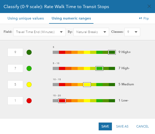 Walk Time Areas
Though design and/or location of the site varies for each scenario, the classification system for each remains the same.
The shortest walk time area, which encompasses the area that can be reached from the transit stop in 5 minutes, is shown in dark green. The area traversed between 5-10 minutes is in light green, and the 10-15 minute range is shown in yellow. Ranges shown in red are 15-20 minute walk times and are the least desirable, where the 5 minute, dark green ranges are the most desirable.
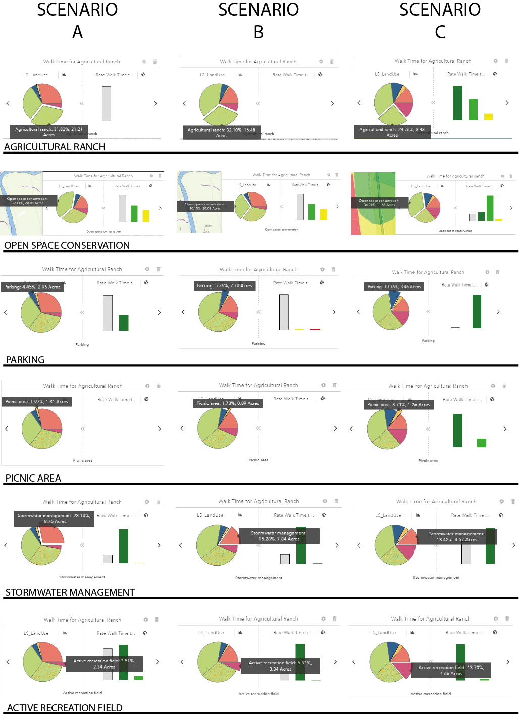
Scenario Land Uses and Walk Time Areas
In many cases, the dashboard where you could compare walk times and land use types showed up blank, indicating that those land use types could not be reached within a 20 minute walk.
In Scenarios A and B, the best walkability/ease of access was to areas such as parking, picnic area, stormwater management, or recreation. This was by design: in order to reach agricultural ranch land, or snail farm land, you had to walk a great deal more. Though the snail farm is meant to be educational, it is purposely set back to protect the farm from any unwanted intrusions. In Scenario C, however, because the transit stop from which all walk time radii was located right next to the centre of the site, there is a great deal of ease of access to most of the land types.
The chart below shows a comparison of each scenario, its land use type, and the walkability ease associated with it.
Scenario Comparison
The following images compare two scenarios side by side, showing differences in amount of land use, site placement, and layout.
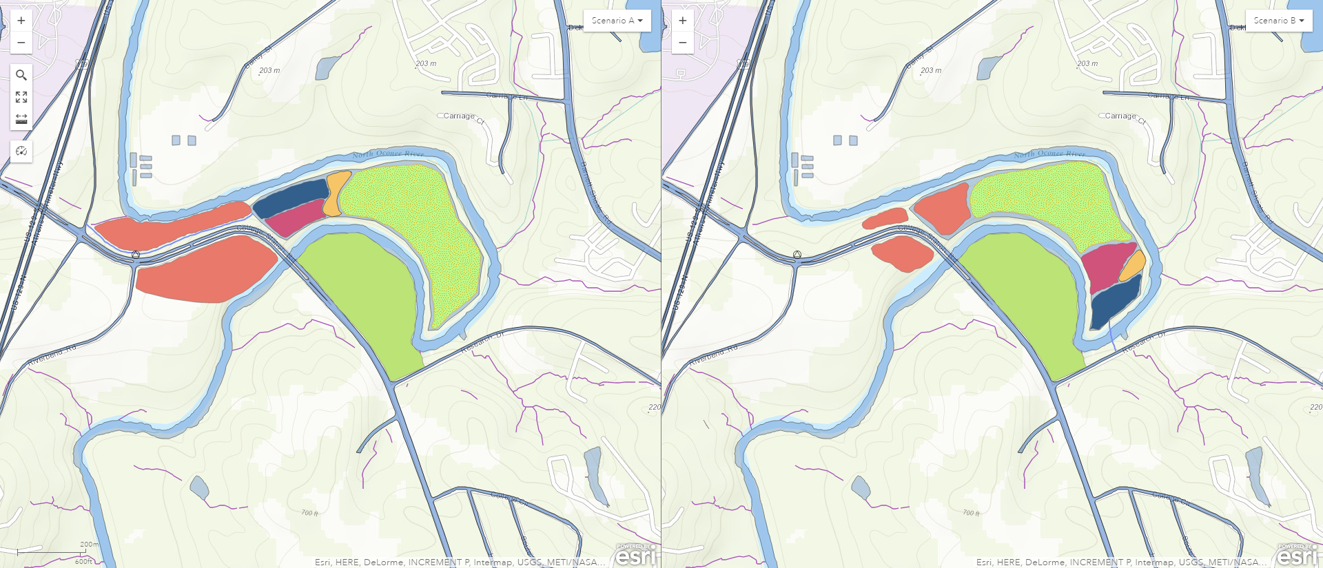
Scenario A v Scenario B
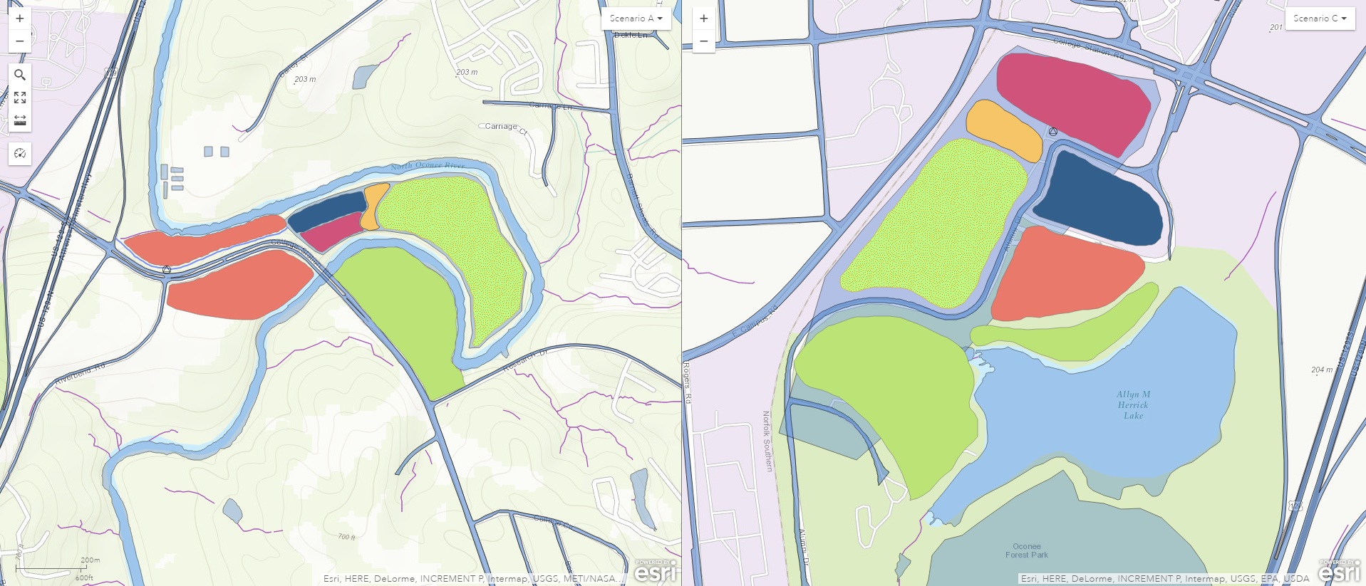
Scenario A v Scenario C
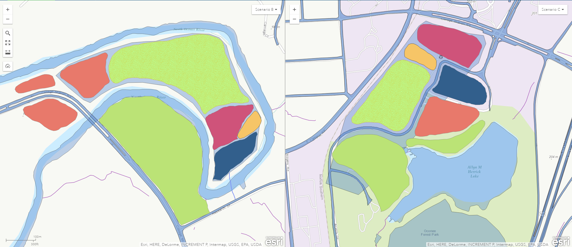
Scenario B v Scenario C
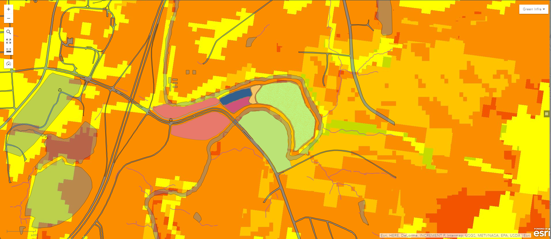
Scenario A and Green Infrastructure
As a whole, the area is not conducive to green infrastructure. The closer to red, the more unsuitable the site is. The closer to dark green, the more suitable the site is. The vast majority of the area is shaded in yellow and orange, but a slight bit to the northeast is shaded in green. The Swipe function allowed me to look at this overlay on top of my design.