Scenario C is located on Site C, which is marked on the map from the first Geoplanner exercise here. Now, this site offers the least suitable land for snail farming as far as the type of land goes. However, it does have the most potential for development based on its location and current ease of access. For that reason, I chose it as my second alternate site design.
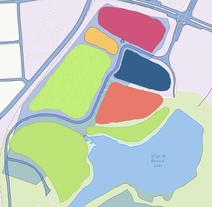 For scenario C, the sizes of all of the land types are much smaller, partly owing to the fact that there are boundaries imposed by existing roads and bodies of water.
Conservation areas, shown in green, form buffers between the ‘active’ sites, i.e. recreational, farming, or road areas, and Lake Herrick, which needs to be protected. A stormwater management site, shown in red, lies in between a conservation area and the parking lot to further mitigate any damage that could be caused to Lake Herrick’s natural functions due to development of a snail farm. As for the snail farm itself, shown in green with dots, it occupies most of the actual development site that is bounded by the blue box. Together with the picnic area (yellow) and active recreation field (magenta), the three form the ‘active’ part of the site.
Site Suitability
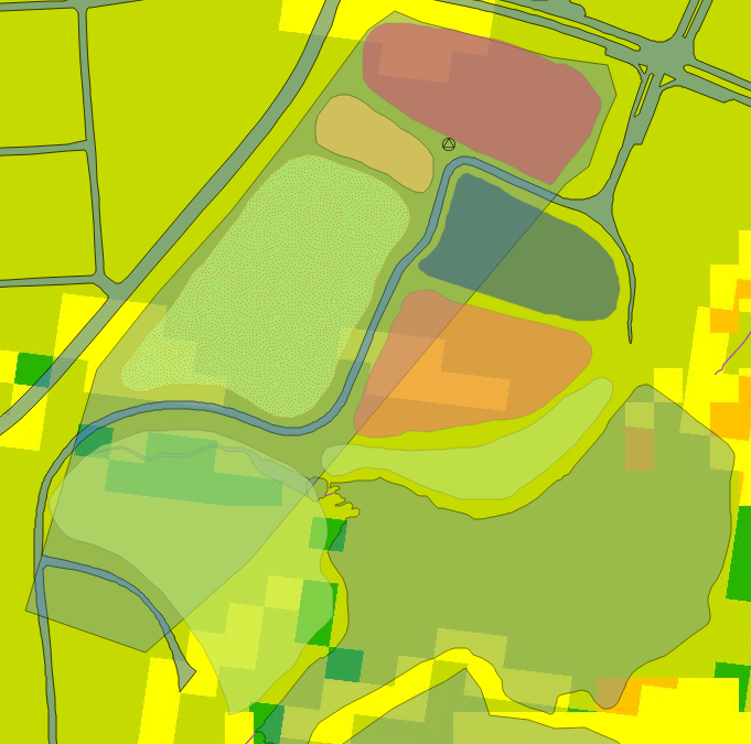 The site itself is relatively poor in quality according to the standards set forth by the suitability analysis. It is mostly covered in yellow and light green patches, indicated that its suitability is fair to poor, especially in comparison to sites A and B. The most suitable land for snail farming is located so close to Lake Herrick that developing it for such purpose would be irresponsible, thus the creation of a conservation buffer there. Despite the apparently poor suitability of the site, it is advantageous for development in that it already has access to major roads, is easily walkable, and the different aspects of the snail farm/park can be easily fit into the existing shape of the site.
Site Breakdown
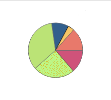
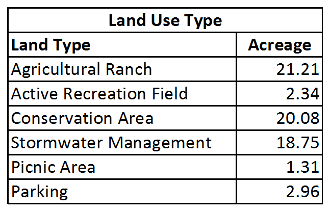
Though some of the developed area falls outside of the blue bounding box for the site, the total acreage and breakdown of landuse type need to be shown for full understanding. To that end, the pie chart visually, if roughly, illustrates the percentage of acreage each land type use makes up. For further understanding, the exact acreage is broken down in the accompanying table.