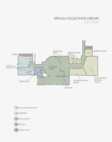
On my first solo trip to Hargrett Libraries reading room, I felt anxious. In the days and minutes leading up, I pored over Dr. Camp’s guides on the rules and etiquette of special collections viewing, as well as the libraries floor plan. I tap and pinch and scroll compulsively only to confirm what I already know: top of the stairs, first door on the left.
Rare books—from the well-worn and hundreds of years old to the artsy, new, and innovative—were almost literally within reach. Basements and subbasements, layers of lairs of amazing books that I could hold in my hands, could turn over and flip through and feel. It was precisely this… this particular aura of the special collections reading room that had me anxiously checking and rechecking those guides. “Wash your hands.” “Don’t touch the ink.” Third floor, first door on the left. This aura of wondrously fragile objects, so close to my unsupervised fingertips, was quickening the urge to pull out my phone one last time… Just to be certain…
I had surely looked the guides over enough times, already, to have all their pertinent information up in the ol’ noggin. Still, some part of me needed those guiding words and images—made stable and material on the screen of my phone—to keep me grounded and oriented, if only psychologically.
Michel de Certeau argues, in The Practice of Everyday Life, that we ought to view reading more as an act of production than one of consumption. The reader’s “drift across the page… the improvisation and expectation of meanings inferred from a few words, leaps over written spaces in an ephemeral dance” (xxi). De Certeau’s book calls on us to examine those ways that people carve out their autonomy through mundane, unconscious actions in an increasingly structured world. That is why, in these blog posts, I will be tracking my own actions (conscious and otherwise)—as a reader and student—along with my findings on that book that was waiting for me in Hargrett’s reading room. I hope that by treating both the book and its reader with equal importance, I can unearth something a bit more substantial about its functionality.
It was on Jason Hasty’s recommendation that I had called up [Folio PPR P724 P7], or 43, by Robin Price, with Annotated Bibliography, that day. It was this artists’ book that led me down the rabbit hole of research that culminates here. It was 43—and, of course, Dr. Camp’s indispensable guidance—that prodded me, however indirectly, to corners of this campus that I’d never thought I’d visit.
Let’s begin, briefly, with the genre itself. Artists’ books are self-sufficient pieces of art that use the book-form as their canvas, often in imaginative ways. They can be reproducible, mass-printed philosophical tracts that play with layout and typography to deconstructive effect, like Jaques Derrida’s Glas. They can be one-of-a-kind sculptures carved out of existing books like M.L. Van Nice’s Swiss Army Book. Or—and more typically—they can be limited-run editions created by master bookmakers who draw from their deep knowledge of the craft. Such artists bring together innovative and artisanal techniques to create a unique book art that “strives for cohesion” (Hubert & Hubert, p. 11). It is one of these sorts of artists’ books that has been pushing me along since September.
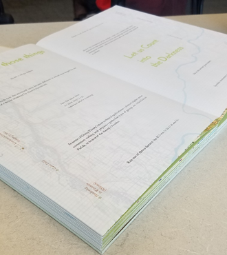
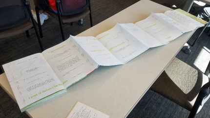
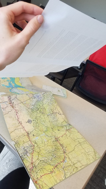
Robin Price had the idea for 43 on the night before her 43rd birthday. With decades of printmaking, bookmaking, and publishing experience under her belt, 43 is one more manifestation of her technical expertise and numerous. The main text of this book consists of brief excerpts from a variety of books (artists’ and otherwise), printed in handset ATF Garamond and Kabel type, cast at the Dale Guild Type Foundry. These excerpts—from the 43rd paragraph here, the 12th line of a poem there (4 times 3, equals 12, of course), the 86th page (two 43s)—are laid out like islands on translucent ClearprintTM graph paper. And this is only the top layer of 43’s double-accordion structure (see below). The bottom layer consists of maps, of various locations along the 43rd parallel, pasted onto Fabriano TizianoTM (a heavy-duty paper of cotton and cellulose). All of this information is readily available in 43’s introduction and colophon. (Un)fortunately, I had not paid much attention to these self-reflexively bookish paratexts until my third viewing. I was too focused on simply handling this book.
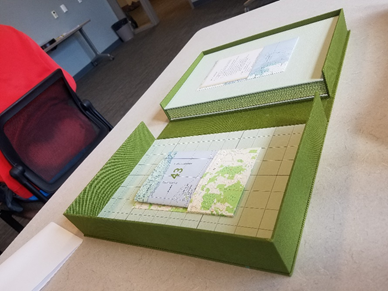
43 was handed to me in its tailor-made clamshell case. It is visually appealing in olive green with a minimalist river form in teal, running from top to bottom cover, across the spine. It feels hefty, substantial at 11.75 x 8 x 1.5 inches. And it’s engaging to the touch; its finely constructed canvas material begs you to run your finger along the course of the river. When you open the case, before you even pull out the book, you are faced with two more, thoughtfully-pouched paratexts: the field-guide sized “Annotated Bibliography” on the reverse of the clamshell’s top cover, and “Legend” card on the front cover of the book.
Critics Renee and Judd Hubert emphasize the performative aspects of artists’ books. Many in the genre utilize such a case, they say, “not so much as an attractive protection for their contents… but to provide a stage where the various elements of the book can interact” (11). 43’s case is no exception. It forces readers to consult these guides before getting to handle the book-proper, thus prefiguring the performative journey that is “reading” this book.
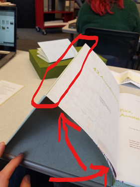
I finally opened the book as I would any other: unfolding it across its Y-axis, to two facing pages, grabbing single folios between my fingers to flip through the book. (I know this is an unsettlingly specific description of such a mundane act, but this is precisely what artists’ books do. They defamiliarize the ubiquitous. They force us to take a closer look at how we use these oh-so-familiar objects.) But, because the top layer of 43’s accordion is a more supple substrate than the bottom, when itis opened in this codex-typical posture it springs up at the center’s fold (see above image). This tantalizing peek at the bottom layer’s maps had me dying for a better view. Can I unfold it vertically too, I wondered, like a folding roadmap? Nope. And I definitely didn’t want to try too hard. This is a rare book after all.
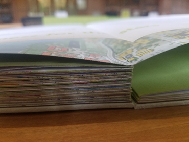
But I suddenly remembered… or maybe truly realized for the first time… that this is an accordion book! So, I carefully slid the two unspined covers apart, revealing about 8 pages (as far as the reading room’s desk would allow). I could now peel the top layer up a smidge more before getting into risky tautness territory. This did allow for a slightly better view of the maps underneath, but I still couldn’t get the unobstructed, birds-eye view that I really wanted.
Again, it is not until my third viewing, almost 2 months later, that I realize that the two layers of the accordion are not hinged at their terminal edges (see images below). The two layers can be taken apart! I lift the top layer, finally deconstruct 43 to reveal an unobscured vista of all the bottom-layer’s maps. This is a book that rewards, more so than a thorough reading, a thorough handling.
In my experience with 43, I felt like I had followed a choreographed dance. It was the way that 43’s materiality—its playfulness with the codex’s form, its remediation of the road map’s—turned me into its performer. I started to wonder how TEXTs teach us to read them through their materiality. I wanted to know exactly how they inform us through our tactile feedback: how their physicality organizes and authorizes certain actions. But can such acts of authorization be consistent with de Certeau’s assertion of the readers autonomy?
Click through to the second post (arriving Thursday, December 2nd) in this series for a deep dive into the underbelly of map-function.
Works Consulted
De Certeau, Michel. “Reading as Poaching.” The Practice of Everyday Life. Translated by
Steven Randall, University of California Press, 1984, pp. 165-176.
Hubert, Renee and Judd. The Cutting Edge of Reading: Artists’ Books. Granary Books. 1999.
Price, Robin. 43, According to Robin Price, with Annotated Bibliography. 2007. Robin Price. Rare
Books Vault, Special Collections Library, University of Georgia.
Header image: “Maps” opening, showcasing the view of 43‘s bottom-layer accordion that such a position allows