By Kinsey Poland, Khayla Doby, William Baldwin, and Trisha Hyatt
The Question
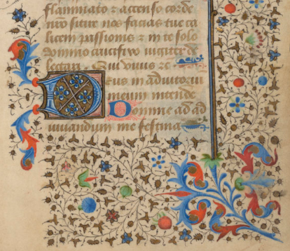
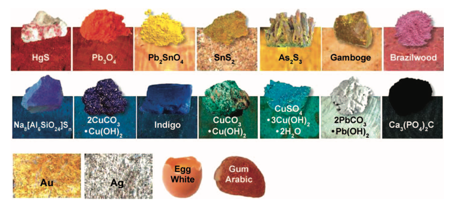
For the Hargrett Hours spectral analysis project, our group focused on analyzing the pigments used in the manuscript’s borders. Once we knew what these pigments were, we could compare them to the pigments in an average palette from the same time period. The Hargrett Hours has been determined to be a 15th century French manuscript, possibly connected to the Saint-Chapelle church in Paris. If the pigments in the Hargrett Hours match the pigments used in other 15th century French manuscripts that have already been analyzed, it reinforces the interpretations of past researchers who worked with this manuscript. To find out the chemical makeup of the pigments in the Hargrett Hours, we used a portable X-ray Fluorescence (p-XRF) machine. This equipment helped us discover what chemical elements were present in various samples of pigments from the Hargrett Hours’ borders. We evaluated the data we received from this device and checked our findings against the average palette of a 1400’s French decorator, which is shown below.
The Hypothesis
Before going any further, this is a helpful read to set up our expectations and findings to come. TL;DR: Pigments are made up of elements from the periodic table. We can use very energetic light, X-rays, to knock electrons around inside these elements. The energy released when the electrons settle tells us which elements have been excited. The more excited an element got, the higher the “peak” of intensity in the resulting energy spectra. If we know what elements make up a pigment, we can use this to help us determine the pigment. The biggest limitation of this is that we cannot see any element with an atomic number lower than 16 (like carbon, which is 6 on the periodic table). When you see all the other elements in a pigment below and wonder why we didn’t look for the other elements, it’s because we cannot see those elements in the spectra.
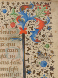
The pigments in the rinceaux border we analyzed were red (yes, it looks orange, but the pigments used to make it are red), green, blue, and pink. Our predictions for the pigments used to make these colors are the following:
- Red – Vermilion (HgS) and/or red lead (Pb3O4)
- Expectation: Significant mercury and/or lead peaks
- Green – Verdigris (Cu(CH3COO)2· [Cu(OH)2]3·2H2O)
- Expectation: Significant copper peak
- Blue – Azurite (Cu3(CO3)2(OH)2)
- Expectation: Significant copper peak
- Pink – Organic
- Expectation: No significant peaks
- White – White lead (2PbCO3·Pb(OH)2)
- Expectation: Significant lead peak
Red was the biggest mystery for us when trying to pinpoint what the pigments could possibly be because there was significant bleeding or corrosion from the pigment on the other side of the page which indicated some sort of chemical reaction. We thought this effect might be caused by a discoloration of mercury which is known to happen spontaneously or from being mixed or layered with white or red lead, both of which could turn the pigment black (Thompson 107).
The Process
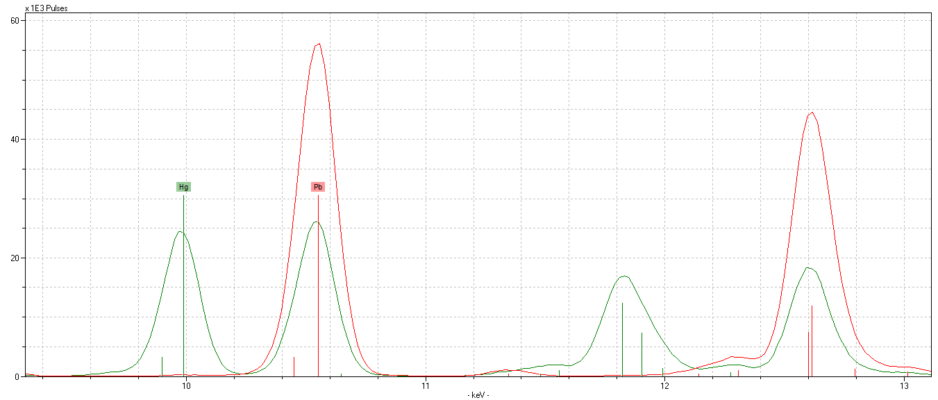
Once the p-XRF analysis was conducted on relatively isolated pigments in the borders, we used the resulting spectra to interpret their elemental makeup. The program used for the analysis of the spectral data, Artax, takes the files generated by the p-XRF machine and produces a visual representation of the excitement of elements in the material (see figure below). By analyzing the peaks in the spectra, we were able to qualitatively determine the relative abundance of the elements present in the borders. By comparing the makeup of the expected contemporary pigments and their characteristic elements to our spectra, we established the identities most of the pigments present.
The Results
By the end of our analysis, some of our results lined up with our hypotheses and some were different from what we expected to find. The green pigment contained copper, which agreed with our hypothesis that it was verdigris. From the lead peak in the spectra for white, we determined the white pigment was white lead. The blue pigment, though surprising, was not problematic. Since we had anticipated that it would be azurite, we expected to find copper in the spectra. Instead we found a lot of lead and an insignificant amount of copper. From this, we concluded that the pigment was actually an organic substance, like indigo, mixed with white lead. The spectra results from the pink pigment were inconclusive. Because of the complexity of the rinceaux border, we were unable to obtain a clean testing spot and, therefore, had a variety of elements from different pigments showing up in our spectra. We deduced that the pink pigment was most likely some sort of organic pigment like the brazilwood shown in the palette above, but we cannot decisively say what the pigment is because of the limitations of the p-XRF. The same is true for the blue.
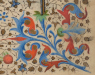
The red pigment gave us the most interesting results. Instead of solely finding mercury in our spectra, we discovered that most of the red testing spots had lead in them but some red testing spots had peaks in lead and mercury, signifying that red lead was used in certain spots and vermilion mixed or layered with red lead was used in other spots. The discovery that there were two different red pigments used explains why the red pigments are visually different and some of the discoloration and bleed-through effects. It does not, however, answer why the red lead exhibits some of these effects on its own. Why the decorator chose to mix vermilion and red lead sporadically is a mystery probably lost to time and the answer is most likely pretty mundane. Maybe he was just experimenting or ran out of paint. He probably didn’t think some college students 600 years later would expose him like this.
Our research into the pigments has given us a deeper understanding of the Hargrett Hours, and we are able to make further observations about the manuscript. For instance, we know that the Hargrett Hours contains relatively few embellishments and no miniatures. Our analysis of the rinceaux borders showed that many of the pigments used were cost effective alternatives to their more expensive counterparts, like red lead. These two facts combined support the theory that the Hargrett Hours is a lower budget manuscript. Another, more important, implication of our findings is that the pigments do indeed match the average 15th century French manuscript palette, providing further evidence of the provenance of the manuscript discussed at the beginning of this post.
Bibliography
Melo, Maria João, et al. “A Spectroscopic Study of Brazilwood Paints in Medieval Books of Hours”. Applied Spectroscopy, vol. 68, no. 4, 2014, pp. 434-43, DOI: 10.1366/13-07253
Thompson, Daniel V. The Materials and Techniques of Medieval Painting. Dover Publications, 1956.