In Fall 2019, we’re combining the two strands of this series of courses, the materials analysis of medieval manuscripts and the student research into the Hargrett Hours, into one glorious project:
We’re going to analyze the inks, pigments, and golds in the Hargrett Hours.
There’s a number of reasons why this is an important project. First, of course, there’s just the “I wanna know!” element. We have no reason to believe that the artists decorating the Hargrett Hours were doing anything abnormal for Parisian manuscript production in the mid-fifteenth century, but how will we know for sure unless we test it?
Second, doing the pXRF analysis of the Hargrett Hours will get us additional information to help confirm or deny some of the outstanding questions we’re still researching. These questions primarily concern the integrity of the manuscript. It appears to be produced all of a piece, with a clear theme and consistent pattern of decoration. But of course, we modern people want the manuscript to be a coherent whole, because it aligns with the story that we want to tell about the manuscript based on its contents. As (primarily) humanities majors, we’re really good at telling stories about the artifacts that we examine. But sometimes our desire for a good story overreaches what the evidence about the artifact will allow, so we’re asking a series of questions based on that story to see whether our narrative of integrity will hold up.
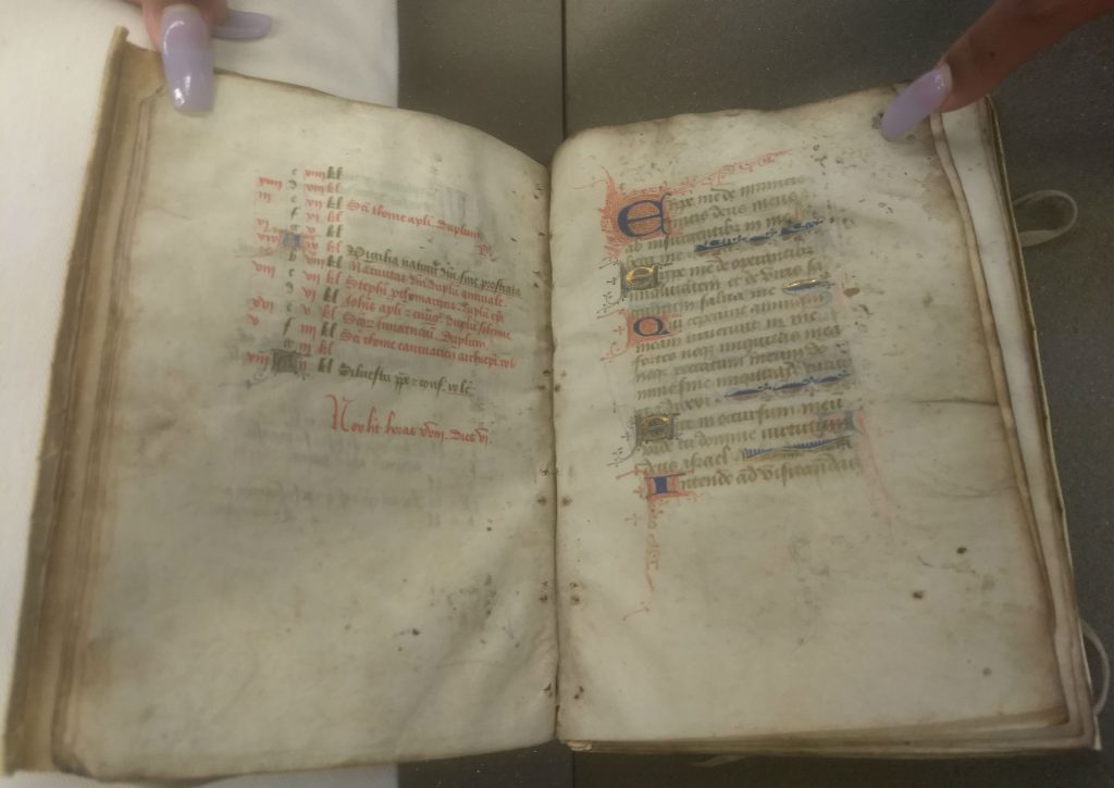
For example, we know that the calendar is executed in a different hand than is the rest of the manuscript, as you can see by looking at the f.12v-13r opening. Given similarities between the content of the calendar (specifically, the evidence that it’s Use of Sainte-Chapelle) and the content of the body of the manuscript (the heavy emphasis on the Passion of Christ; the Parisian saints in the suffrages), it does seem like they were meant to go together, codicologial evidence of difference notwithstanding. So we’re going to compare the chemical makeup of the inks and pigments in the calendar to that used in the rest of the manuscript. Now, similarity or difference doesn’t prove or disprove integrity. Just because two scribes were using the same materials doesn’t mean they were necessarily building the same manuscript at the same time, and vice-versa. Nevertheless, it will give us one more data point for that question.
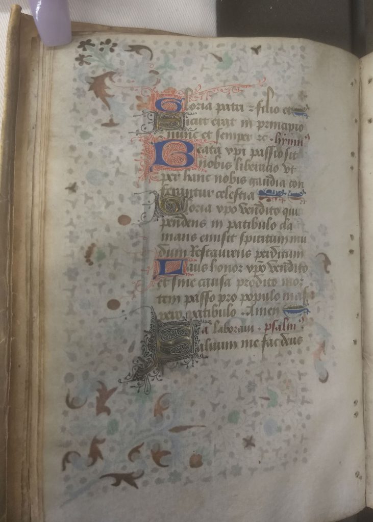
There’s a second, related curiosity that we want to interrogate. Randomly in the middle of the suffrages, right in the middle of a quire, the scribal hand changes for just one folio (f. 60) from the light brown ink and more rounded ductus of the main scribe to a deep black ink and thornier ductus of a new scribe.
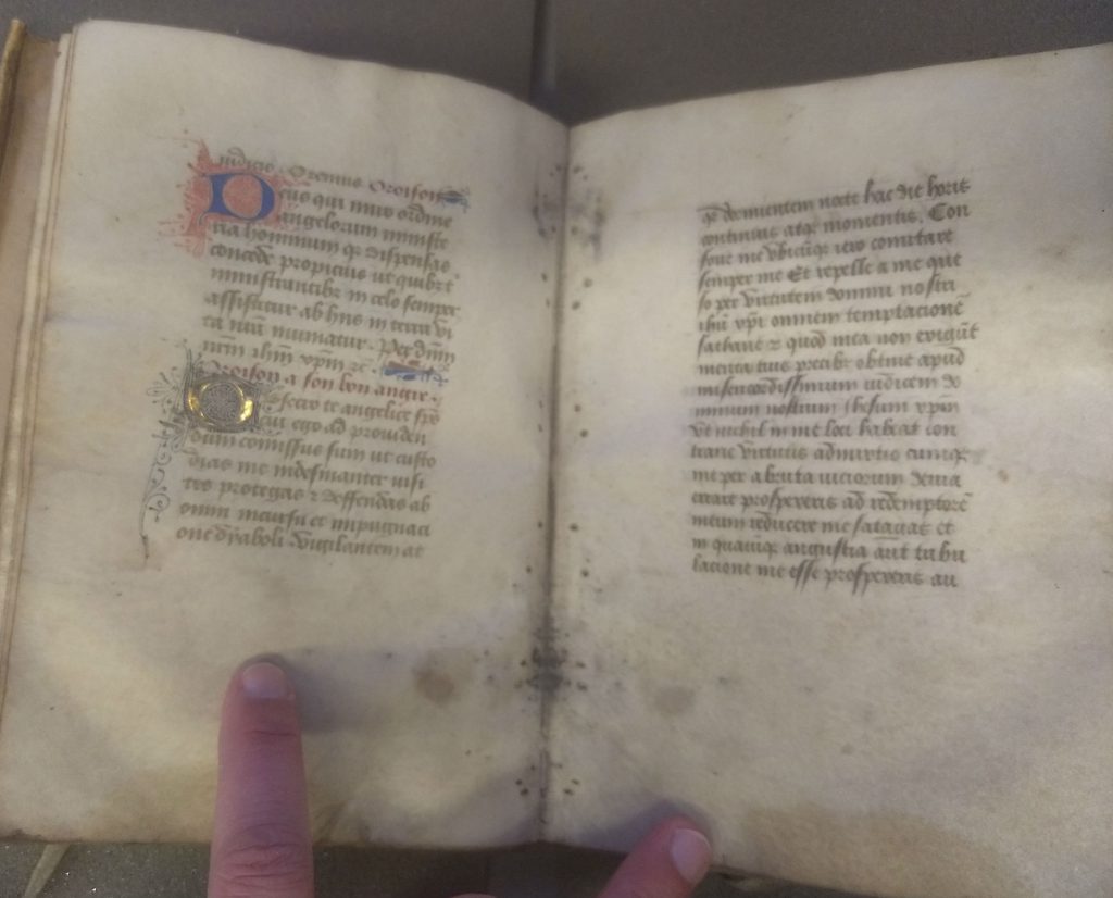
And the ink and scribal hand of this folio looks a heck of a lot like that of the calendar scribe. While we’ll never be able to answer why we have this different scribe for just one folio, we can maybe see whether this page is chemically consistent with the calendar. Again, it’s not proof of anything, but it’s one more piece of evidence toward building a case for the integrity of the manuscript.
One codicological element that does support the argument for integrity is the second scribe. With the exception of f. 60r, the body of the manuscript is executed in the same scribal hand with what seems to be the same ink. Moreover, the separate texts flow over quire breaks, demonstrating that all of the different Passion texts were meant to go in this order, that they weren’t produced piecemeal in quires and then combined later into a complete manuscript (which occurred frequently, as Dr. Kathryn Rudy has shown). So we’re also testing the inks and decoration (the blues, reds, and golds) from the front and the back of the manuscript to see whether they are chemically consistent.
Finally, we’re testing the colors of the border pages – because why not? This is the highest level of decoration in the manuscript, and the execution is lovely. But the chemical makeup of these pigments may help us understand the level of opulence (or lack thereof) in this manuscript. As other classes have suggested, the combination of Passion texts that we have here suggests a first owner who is deeply invested in this manuscript as a prayer book more than a book for showing off, even though the borders are so finely executed. So we might expect the owner to have paid for good, but not extravagant, pigments — azurite rather than lapis lazuli for the blues, for example.
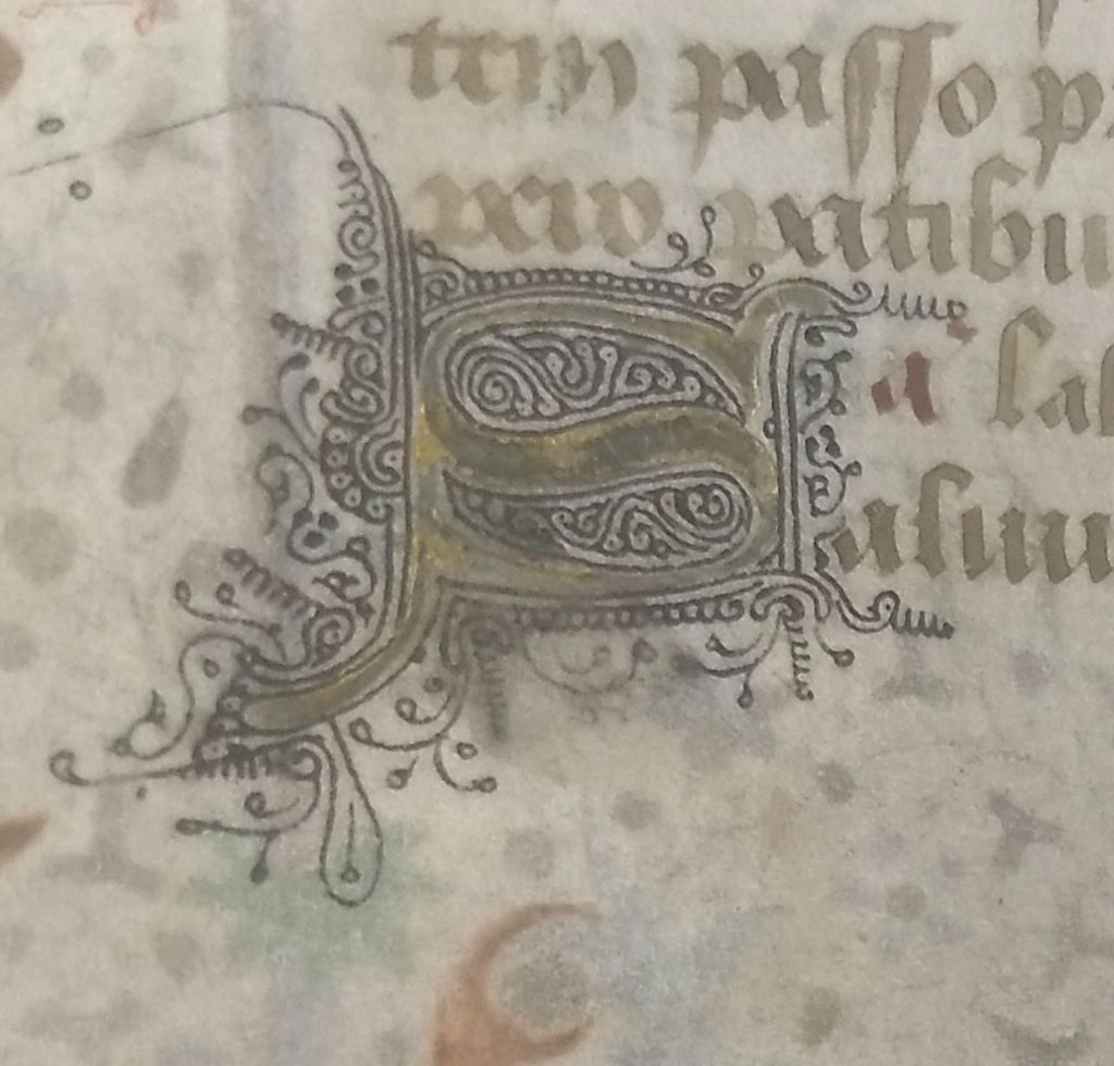
The gold leaf is another place where we can interrogate this question. The gold on the initials is wearing very badly, as you can see above. Does that signal a cheaper alloy, or just lots of wear and tear? Moreover, in examining the gold in the rinceaux borders in preparation for the testing, we discovered that the borders may be executed in shell gold (a gold paint) instead of gold leaf. If that’s accurate, and what that may mean – well, we’re working on that.
Finally, and most compellingly, is this orange in the borders.
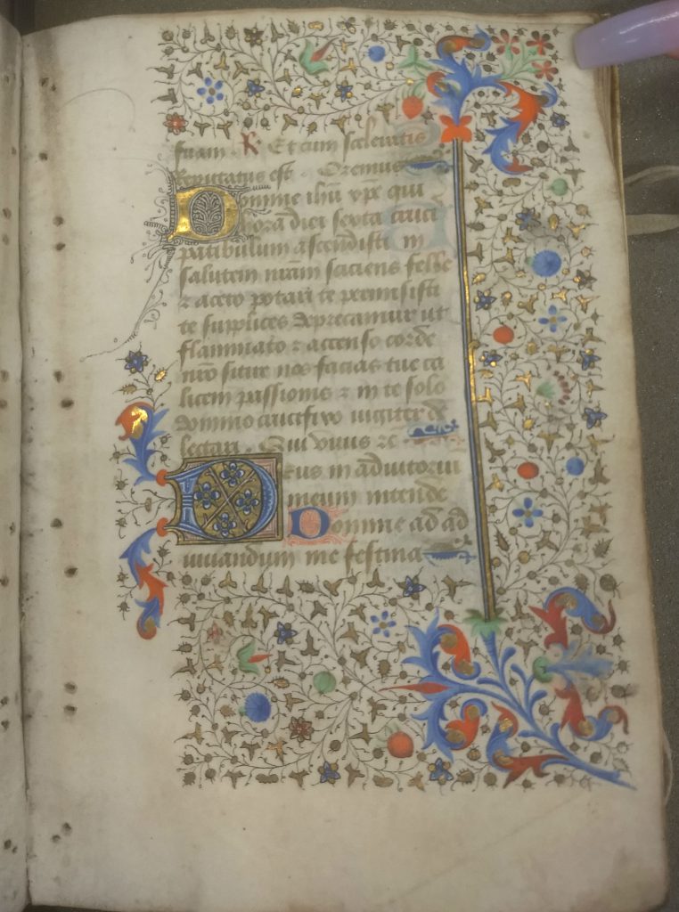
It’s bright, it’s vivid, and it’s so corrosive that it’s making sharp and dark bleedthrough patterns on the verso. What is it?
Stay tuned – we should have answers, or at least better questions, in a few weeks!
With special thanks to one of this semester’s students for being my hand model and holding the pages for me!