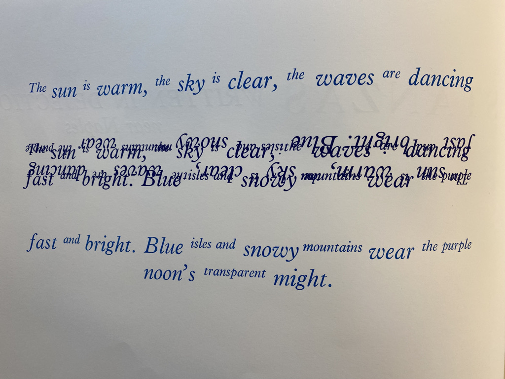
In some ways it’s cheating to study a 2018 book for a medieval class, but in many ways it’s not.
Artists’ books (or artists’ publishing[1]) follow a tradition not unlike that of medieval texts. Each tradition produces bespoke, unique (or close to unique) texts with both aesthetic and functional purposes. And though the former first developed around the 1960s,[2] the techniques we use to interpret medieval manuscripts still apply. While these books harbor no secrets of the past, they remain an excellent study in the unspoken ways we convey information and contain ideas. Artists’ books are treasure troves of communication that challenge our concepts of what a book ought to be.
Take, for example, the work of London artist Susan Allix, who published Sea Air, a book of “poetic interludes and interventions” from canonical poets alongside her own original prints and illustrations of seascapes.[3] It would be easy to view the work as no more than a picture book, but Amanda Clark argues that physical artists’ books like Allix’s are containers of meaning. That is, a book-like shape already bears content through its association with books, even if it is unopenable and entirely blank. Further, an artist’s decisions are contained in the materials their object is composed of, materials which then create an environment through which the story is told.[4] So meaning is structural, embedded in physical shape and form even without the semantic content of words and images.
Artists’ books are notoriously difficult to define because of the wide gamut of objects the name encompasses. Yet, all of them are united by how they challenge the material and design constraints of other books.[5] Then, Allix takes advantage of the freedom of her medium to better contain the environment of sea air within Sea Air itself. The poetic excerpts all concern water and sands, but Allix principally creates meaning with material.
Material, Girl
A ‘normal’ book today achieves its normality through careful selection. Size, paper, ink, binding, and so on are used less as modes of creative expression than as genre indicators. Book publishing has conventions that dictate form, just as academic essays use Times New Roman font for its standardizing rather than aesthetic value. In comparison, Sea Air is free to use whatever form best suits its individual purpose. Susan Allix sees fit to give a detailed description of her materials in the colophon of Sea Air because materials are uniquely important to the book. Among her materials are custom wood letters, graphite, water based inks, and four different kinds of paper named by brand. Such variety and specialization is impracticable for large productions but possible for Sea Air since it was made as a sculptural object in a run of only fifteen.[6] This rich material diversity of the book facilitates the impression it provides of sea air.
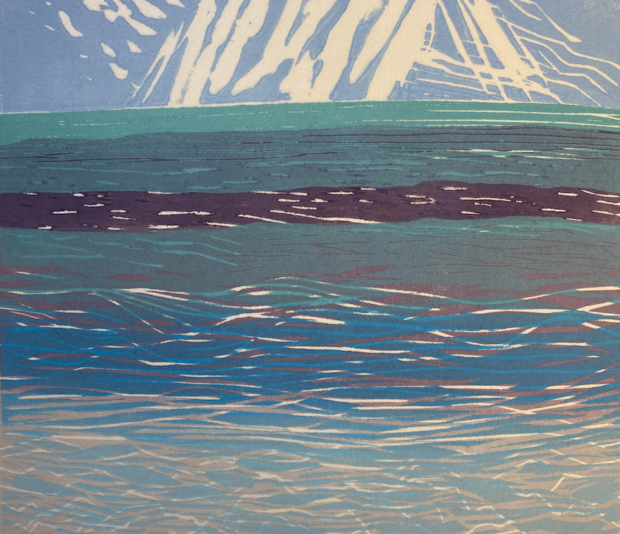
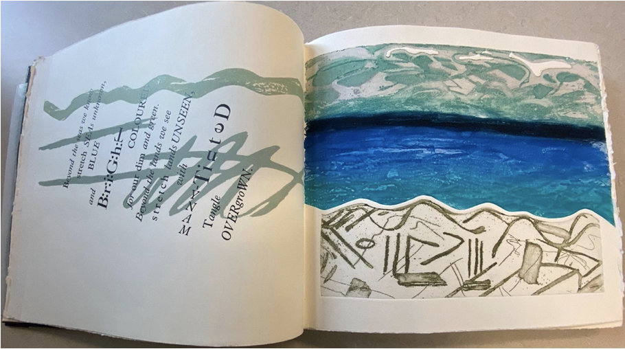
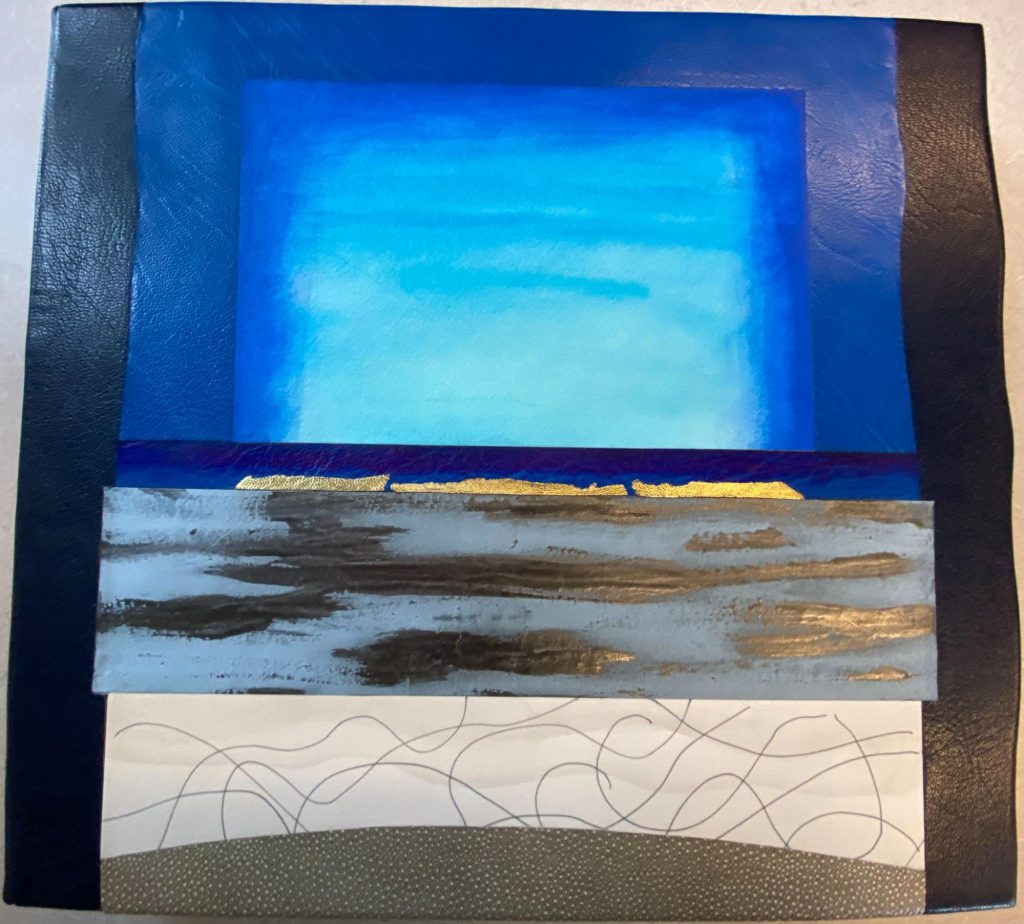
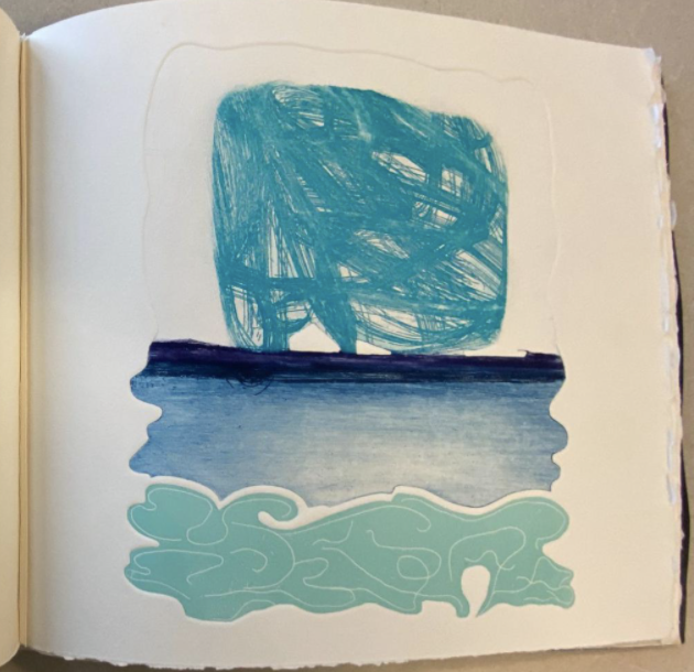
Starting from the obvious, Sea Air is unabashedly blue. The deep navy blue leather cover, with its wavy live edge, imitates the waves of the ocean as black lines outline the breeze flowing over the pasted coastline. And inside, print and text alike navigate shades of blue. Even the prints themselves are sugar-lift aquatints[7] in navies and teals, etchings on zinc plates meant to imitate watercolor.[8] This visual bombardment alongside cream pages means the view while reading is always evocative of coastal horizons.[9] Consider as an example the first image of the Noon section. The white lines on aqua at the bottom of the image represent waves, the teal block is flowing air, and finally the central swathe of blue running upward light to dark imitates the sun reflecting across the sea.
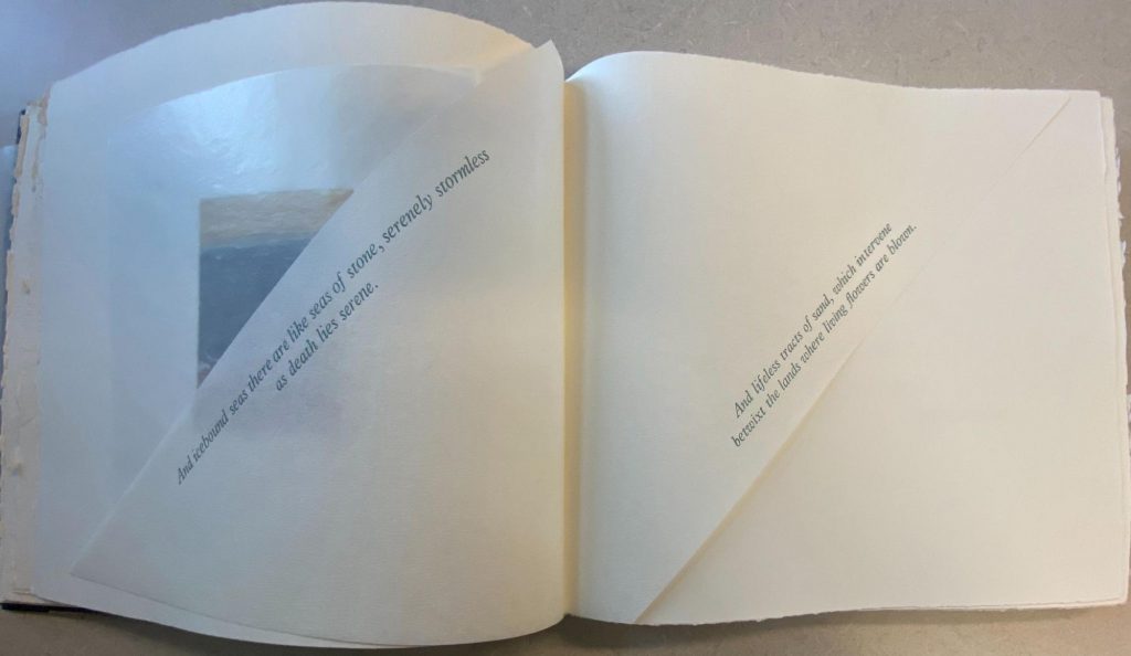
Building the image of a coastline further, Susan Allix leaves deckled edges on the rough mold made paper,[10] creating the textural experience of sand. In order to read the 34 by 37 centimeter pages, it is necessary to feel this with both your hands. Then, protective covers and Japanese paper[11] work together to obscure several images in a salty haze, at last making visible the air which implicitly blankets the book’s myriad horizons. It’s not that any of these aspects are remarkable on their own. Rather, the interaction between materials and their presentation together creates the meaning.[12] Deckled edges become sand with the paper’s roughness, and Japanese paper haze with the aquatints’ watercolor, so that the entire book physically embodies the seaside without a need to read a single word.
So Sea Air shows us the semantic power in the selection of materials. But it doesn’t stop there.
Text and Textu(re)ality
Language may not be Sea Air’s main container of meaning, but its poetry is still purposeful. Drawing on the concept of graphic devices[13], the arrangement of words on each page also contributes to meaning. With the slanted poetry printed on translucent Japanese paper, Allix physically places her selected poem into air, where it crosses an ocean illustration diagonally as if part of a gust of wind. Flipping through, these pages overlap to imbue motion through contact. Their physical arrangement enhances the written images of “interven[ing]” and “blown” wind[14]. In the Noon section, blue and teal words overlap themselves, their placement imitating the sea as much as the prints do. Here, the Plaintin typeface[15] in italics is wavy in its own right, and the wavy letterforms of text on this page crash into each other as real waves. There is no element too small to consider as meaning bearing[16], and the font choice has its own persona[17], free and ‘dancing’ alongside the text’s words, and in size ebbing and flowing like an ocean.
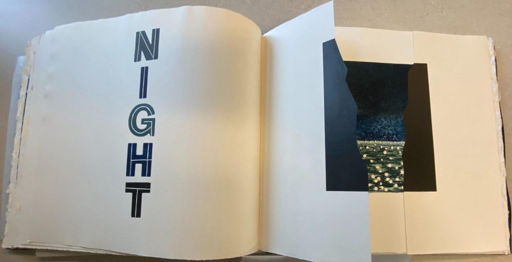
A second graphic device which sets the Sea Air scene is its navigational element. Rather than page numbers, the book relies on sections titled with non-sequential spaces and times, connecting the reading experience to a physical journey through landscapes. This deemphasizes the traditional narrative structure of books to centralize the experience of Sea Air in whatever quality you see fit: at night, in a haze, as part of the waves, etc.
Seeing Air
A book need not be limited to its words for semantic content. Sea Air bears the sea within the very fabric of its pages, through its materials and their intersections, and in the arrangement of language on the page before ever attending to its words. It demonstrates that artists’ books contain intangible things in a binding even without language; the form and arrangement of an object, however much designed to be ignored, is always a powerful tool of expression.
One day, our remaining works will trickle into special collections and school syllabi to be studied by students like us. Three years old, Sea Air is already there. Artists’ books like it facilitate explicit engagement with questions medieval manuscripts don’t explore as widely. In taking the time to understand better how today’s experiments create meaning with material, or through the subtle effects of arrangement, we not only leave with better understanding of the creative work around us, but a stronger ability to explore the different book traditions of history and what meanings those forms contain.
References
[1] See White, Tony. “From Democratic Multiple to Artist Publishing: The (R)evolutionary Artist’s Book” Art Documentation: Journal of the Art Libraries Society of North America, vol. 31, no. 1, 2012, pp. 45–56. JSTOR, https://doi.org/10.1086/664913.
[2] Ibid.
[3] susanallix.com
[4] Clark, Amanda Catherine Roth. “Book as Container.” The Handmade Artist’s Book: Space, Materiality, and the Dynamics of Communication in Book Arts, ProQuest LLC, Ann Arbor, MI, 2013, pp. 176–247.
[5] White, Tony.
[6] Allix, Susan. Sea Air: Prints of the Sea with Poetic Interludes and Interventions. Susan Allix, 2018.
[7] Ibid.
[8] Britannica, The Editors of Encyclopaedia. “aquatint”. Encyclopedia Britannica, 6 Aug. 2019, https://www.britannica.com/technology/aquatint. Accessed 16 November 2021.
[9] Harrison, Claire. “Visual Social Semiotics: Understanding How Still Images Make Meaning.” Technical Communication, vol. 50, no. 1, 2003, pp. 46–60. JSTOR, http://www.jstor.org/stable/43090531.
[10] Allix, Susan.
[11] Ibid.
[12] Lehmann, Ann-Sophie. “How Materials Make Meaning.” Nederlands Kunsthistorisch Jaarboek (NKJ) / Netherlands Yearbook for History of Art, vol. 62, 2012, pp. 6–27. JSTOR, http://www.jstor.org/stable/43883869.
[13] Drucker, Johanna. “Graphic Devices: Narration and Navigation.” Narrative, vol. 16, no. 2, 2008, pp. 121–139. JSTOR, http://www.jstor.org/stable/30219279.
[14] Allix, Susan.
[15] Ibid.
[16] Drucker, Johanna. “Graphical Readings and the Visual Aesthetics of Textuality.” Text, vol. 16, 2006, pp. 267–276. JSTOR, http://www.jstor.org/stable/30227973.
[17] Brumberger, Eva R. “The Rhetoric of Typography: The Persona of Typeface and Text.” Technical Communication, vol. 50, no. 2, 2003, pp. 206–223. JSTOR, http://www.jstor.org/stable/43089122.
Featured Image Caption: The illustration from the second full page spread of the Noon section in Sea Air. Photo taken by the author.
