Composting Infographic

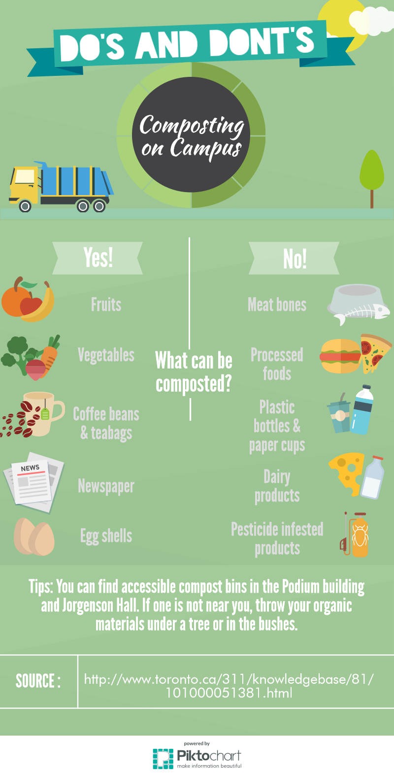
What: This infographic is intellectually stimulating mostly because of the statistic it gives in the beginning to create interest.  It’s relevant to the audience because of the sorts of information it gives- it is fairly simplistic and chooses to include specific products that normal people would not know whether could be composted.  It’s creative not in the info but rather in the design- the colors and sections are nice to look at and easy to read.

Gut: This infographic makes the reader feel happy- the front is super flowery and pretty.  I was surprised at some of the things it said could/ couldn’t be composted (like horse manure, meat scraps, and certain types of lumber.

So What:  I hadn’t thought of all of the things that could be composted or the amount of residential waste that is biodegradable- I definitely thought it would be less.  The creator was hoping the reader would get that perspective- that it’s not hard but would make a big difference.  I don’t know what kind of sources they used, but I’m guessing basic searches online.  We could find this data during class by listing what is important to know then googling those facts.

Now What:  They haven’t considered how to compost at all.  To people that do it, it does seem like a simple process and it would be hard to fit all of this information on a small infographic.  We can try to either create separate infographics or make one with very basic information on it and possibly a link to all of the other important info to read over.

Allaina Siler Composting Infographic


Regarding the three characteristics of effective informative delivery, the infographic is intellectually stimulating because it makes you think about what you can and cannot compost. It causes the viewer to contemplate what materials they have on the infographic at home, and whether or not they belong. As for being relevant to the audience, it would be perfect for the Rooker Hall demographic because the information is specifically tailored for people on campus in a dorm. And, I think it’s creative with its use of the neutral, mellow color scheme, as well as the cute illustrated items that either can or can’t be composted. Also, the three fonts work well together from a design standpoint and would be perfect and easy to read.

As for my gut emotional responses, I was immediately content because it is just so well illustrated and I love the mellow green background with the illustrations of food and other materials. It surprised me that newspaper is compostable because I thought the inks would have chemicals that might be harmful, but I guess not. Nothing angered or frustrated me because this infographic was carefully and thoughtfully made. And, the information didn’t deal with something upsetting like the news.

Before this infographic and this unit, although I barely knew anything about composting, I didn’t think that people would attempt to put plastic materials or processed food into compost piles. I suppose it makes sense with the plastic materials if the theoretical person confused recycling and composting, but I would never think to compost pizza just because I before assumed only fruits and vegetables could be composted. From the infographic, the creator was probably just hoping that the people on campus would gain a new perspective on what they could or couldn’t compost. To find this data, they used one source which is a Toronto informative website with information about what can and cannot be composted. We might engage in finding this data by just copying and pasting the information into a search bar, since they provided the source on the poster.

Although this compost infographic is very successful from a design and informative standpoint, I think maybe they could’ve considered a bit on why the demographic can’t compost certain things. However, it makes sense that they haven’t thought of including this in case there would be too much information that the viewer would not want to read and possibly walk away from the sight of too many words. We can definitely use this as an inspiration for our graphic with the layout of the work because the information is so clearly displayed. Not to mention, we can kind of copy the illustrations (still changing some aspects) for the images of the things that can and can’t be composted.