Composting infomercial

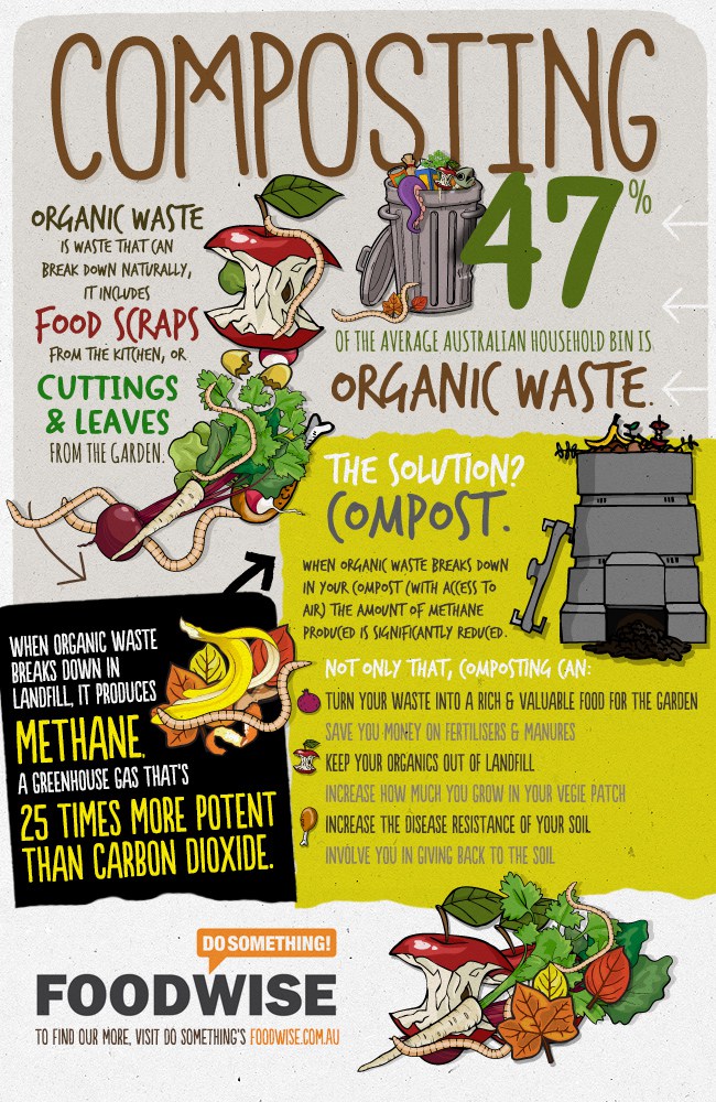
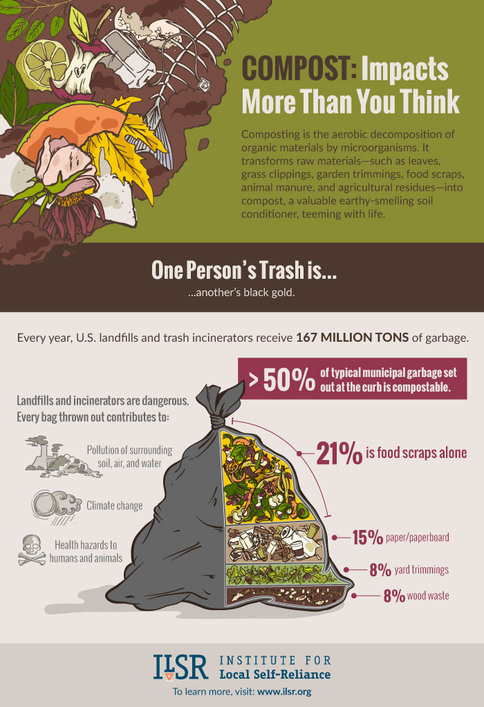
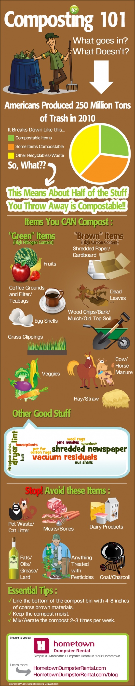
What: The creativity of this compost is without being said and uses a nice blend of colors to grab your attention on to certain details and aspects like the pie graph, also I like the drawings of the brown and green items.  This infographic has relevance to the audience because it stays to the point and doesn’t stray off on stuff that doesn’t matter.  The infographic is intellectually stimulating because. it gives a lot of relevant and easy information to get the point across.

Gut: Honestly the emotional response I got from this was happy with the cartoon cows.  The information that 250 million tons of trash was produced in 2010.

So What: Something I had not thought of before was exactly how much trash humans produced, and it has probably become more since 2010.  I think the perspective the author was trying to bestow with this was that we produce a lot of trash and a lot of it can be composted and reused and is relaying what can and cant be put to a better purpose than a landfill.

Now What: I think that the stuff in this infographic is important and should be included in an infographic created by the class.  The information on how much trash we produce should be included to really put things into perspective.

Infographic Comment

Josh Marcinczyk’s Graphic

1. What do you think the main message of the infographic was?

  • The message of this infographic is that it is very easy to compost at home, and that anyone in any situation can do it. It covers every

2. How was its readability, font, color choice?

  • The graphic was very small, so I google searched the image and found a larger one that was more legible. The color scheme includes greens and browns and felt very natural and appeared earth-like.

3. When we make our infographic, we will be trying to convey information to encourage students to compost, include a comment on what you think the purpose of the infographic was.

  • The purpose of this graphic is to inform the reader on how to compost by providing a question with two or more possible answers, where every answer leads to a different way to compost at home primarily.

4. Include in your comment one thing that should have been cut from the infographic

  • All the information in the graphic is useful and relevant, but some things need more explanation as the reader might not be familiar with some of the terms such as bokashi and upcycled pallet bin.

Composting Info-graphic

Composting Info-graphic

Ryan Southard


What:

This info-graphic is intellectually stimulating because it provides useful information about the reason’s behind composting. It doesn’t just tell you that you can do something, but it tells you what to do, and why you should do it. It is also creative because the visual design is well thought out and is visually appealing.


Gut:

This graphic invokes a surprising amount of hope for me. I constantly hear about environmental issues, but I don’t really ever hear about what we can do to prevent them, so it’s nice seeing something which both informs people of these issues while also giving a viable solution to them.


So What:

I hadn’t really ever thought about the effect that methane might be having. When people talk about greenhouse gases, most people will think of carbon dioxide. However, it’s probably important to remember that other gasses have negative effects and can come from other sources beyond the classic ‘pollution source’ such as cars and factories.


Now What:

I know that I’ve never really given thought to how much my food waste might be affecting our world, so it could be nice to include similar information in our info-graphic for students, as I would assume many of them haven’t considered this as well.

Infographic by Ku Kim

Ku Kim


What: The infographic is very intellectually stimulating because it educates those with apartments on how to make a difference. It’s relevant to the audience (aka those who own apartments) because it appeals directly to them by saying “how to compost in your apartment.” It’s different and creative because I haven’t seen compost infographics or posts geared towards those who specifically live in apartments.


Gut: Initially I really liked the infographic and what it was portraying; however, now that I am analyzing it, it doesn’t educate as much as it could. It generalizes the categories of things you can add to compost, but food is too broad. There are many food scraps that can’t be added in.


So what?: I think the artist was trying to get millenials and those living in apartments to try and compost, even though their living situation isn’t most suitable for it. He or she oversimplified the concept of composting, making it look far too easy to do. They could’ve done more thorough research. Instead, they have not 100% accurate info.


Now what?: I certainly think that after analyzing some infographics, we need to make design and info of the utmost priority. We need to consider how we should appeal to students because why would they be interested in changing their habits if they truly don’t see the simplicity and benefits of it?

Infographic Comment

Karan’s infographic

  1. What do you think the main message of the infographic was?

The main message was that you can compost indoors/ in small spaces and to provide information about how to do it.

  1. How was its readability, font, color choice?

It was sort of hard to see without zooming a lot and scrolling.  The readability, font and colors were fine it was just super skinny and long.

  1. When we make our infographic, we will be trying to convey information to encourage students to compost, include a comment on what you think the purpose of the infographic was.

The purpose was to teach people that live in apartments how to start composting and to simplify the process.

  1. Include in your comment one thing that should have been cut from the infographic

I think all of the information in it is important.  Some of the larger sections could be included in tips instead to save space (such as 7. Find it a Home- where it would work best could be bulleted without a picture pretty easily)

Infographic Response

Response to an Infographic About Coral Bleaching

by Sahir Shahryar

I found this infographic when looking for infographics related to the carbon cycle. It covers coral bleaching, which occurs when the oceans become more acidic as a result of increased carbon dioxide in the atmosphere. The infographic drew my attention immediately with its stark contrast. The grayed-out coral and water really give an idea how bleak a bleached coral reef looks:

The inclusion of clownfish in the ocean scene not only provides a stark color contrast, but may also make a subtle reference to Finding Nemo, a childhood favorite of many young adults today. Although I doubt that the infographic relies on the connection to Nemo to sustain the viewer’s interest, it is a smart visual device to capture the attention of someone who may not be interested otherwise. The use of arrows and bold typography make the infographic easy to follow, and the half-emptied hourglass indicates that “the clock’s ticking” to the viewer. Key figures such as “60%,” “2030,” and “8000 years” are shown in large fonts, making them stand out.

Overall, the infographic evoked feelings of frustration out of me. Seeing the impact that we are having on other life forms when we use fossil fuels makes me upset that there are politicians willing to deliberately look the other way for political gain. I think the author of the infographic wanted viewers to see how fossil fuel usage impacts our environment in more ways than just the obvious.

I think the takeaway from this graphic is that our infographic needs to show the viewer something that they didn’t know about (or hadn’t considered) beforehand. If our infographic can give students a new perspective, then it stands a good chance of convincing them of the benefits of composting — and the need to compost.


Infographic credit: the Forest Stewardship Council (FSC)

Reef comparison image credit: Atoll Volunteers <http://www.atollvolunteers.com/coral-bleaching/>

Inforgraphic- Kunho

What

  • This infographic is intellectually stimulating because it provides several facts and statistics that support its message that composting is important.
  • The information on the infographic stays relevant to the reader because everyone throws away trash and food scraps that could potentially be used for composting.
  • The way the information is portrayed in the infographic is also very creative. It makes use of a garbage bag and divides it up into the percentages that shows how much of the garbage thrown out every day is compostable.

Gut

  • The graphic did make me feel like the community and people in general weren’t doing enough to compost. However, I also felt optimistic because infographics like these will eventually help raise awareness and increase the rate of composting.

So What

  • I hadn’t thought of how much of the garbage we throw out every day is able to be composted. The infographic really does a great job in showing just really how much wasted potential that is.
  • The organization, Institute for Local Self-Reliance, gathered its data from many different sources such as the EPA.

Now What

  • I don’t think that many students have considered how much of an impact they could make on the environment if they began to compost half of the things they would have just mindlessly thrown in the trash.
  • I think that many students haven’t thought of this because they weren’t aware and didn’t know.
  • I think that an infographic that both informs and inspires/motivates students to make small changes in their lives to contribute to a big change on the environment is necessary!

Josh Marcinczyk- Infographic

What: The infographic uses a mixture of words and images to convey ideas which helps to explain ideas. The infographic assumes that readers know nothing about composting, so the track of ideas begins at “Can you compost at home?,” which is square one in my mind. The creativity comes in the natural color scheme; it feels very organic. It feels warm and welcoming also.
• Gut: I feel very relaxed reading it, but I am also curious. It is a bit of a maze/puzzle, with a new result each time. What surprised me is how they addressed EVERY situation.
• So What: I had not realized how many different ways to compost there were at home. They effectively engage me, as even if a route does not concern/include me, I am still inclined to read through and learn about a new way. The creator wanted to inform that there is a way to compost for everyone, and they did that.
• Now What: They have not considered that some college kids do not care about composting, but this was likely not their audience. We are only offering one way to compost, but we can use visually stimulating patterns and natural color schemes to hold attention and contain an earthy feeling.

Soil Infographic

What: The infographic is clearly organized, presenting information concisely without cluttering the page or appearing over complicated.  The information is exctly suited to the audience, having been presented on a site specifically about soils and composting. As for the creativity, the information is presented in an attractive, earthy layout – creative and interesting to look at but not overwhelming to the audience
• Gut: I was a bit disappointed the the graphic focused on fear-mongering moreso than it did on offering information on direct solutions – ie how the issues are to be solved moreso than who should solve them, though I was happy to be able to learn from the graphic.
• So What: I hadn’t thought about soil being technically non renewable due to the difficulty and slow speed of creating it from decomposing materials, and the amount of energy nearly always lost during the process.  I think this was the perspective the creator was looking for – an increased urgency about the matters of disappearing soil across the world. The data came from the UN’s Food and Agriculture organization – a resource we are sure to engage with in class.
• Now What: I don’t believe our students have realized just how important soil is, and how quickly it is slipping away from us – mostly because we’ve been focused on how it is used and restored, not how it is currently being destroyed.  This information can be used to tug at heartstrings and increase the understood importance of preserving and restoring soil.

Composting Infographic

What: This infographic is intellectually stimulating mostly because of the statistic it gives in the beginning to create interest.  It’s relevant to the audience because of the sorts of information it gives- it is fairly simplistic and chooses to include specific products that normal people would not know whether could be composted.  It’s creative not in the info but rather in the design- the colors and sections are nice to look at and easy to read.

Gut: This infographic makes the reader feel happy- the front is super flowery and pretty.  I was surprised at some of the things it said could/ couldn’t be composted (like horse manure, meat scraps, and certain types of lumber.

So What:  I hadn’t thought of all of the things that could be composted or the amount of residential waste that is biodegradable- I definitely thought it would be less.  The creator was hoping the reader would get that perspective- that it’s not hard but would make a big difference.  I don’t know what kind of sources they used, but I’m guessing basic searches online.  We could find this data during class by listing what is important to know then googling those facts.

Now What:  They haven’t considered how to compost at all.  To people that do it, it does seem like a simple process and it would be hard to fit all of this information on a small infographic.  We can try to either create separate infographics or make one with very basic information on it and possibly a link to all of the other important info to read over.