This semester, I have the fun job of putting together three cases for an exhibit in the Special Collections Library at UGA. The Hargrett Rare Books and Manuscript Library at UGA is housed in a beautiful three-story building. The third floor includes a reading room and classroom spaces, while the second floor features exhibition space that features rotating exhibits, showcasing items from the collections. This space is a way to reach the public and allow them to see what kinds of items are housed in the UGA libraries. Anyone can visit these exhibit spaces, and events and tours are offered regularly. In Fall 2020, the Hargrett Hours and all of the related classes are going to be showcased in a portion of this Special Collections gallery.
As a starting point for the exhibit, Fall 2019’s class was told to design one case that would explain how manuscripts were made. The assignment involved picking out items to go in an exhibit case, and writing captions for these items. It also allowed us to experiment with a new kind of storytelling.
This assignment was exciting, as many of the students in the Fall 2019 class were English majors and tired of writing essays. English majors tend to feel that they have a strong grasp on paper-writing by the time they take their upper-level classes, so I assumed that this kind of writing would be simple. I typically have several academic essays to write in every English class that I take. Plus, once your friends find out what your major is, there is no escape from editing other people’s papers. All of this is to say that writing usually comes pretty easily- so then why was designing cases so different?
Case design involves telling a story through both objects and words. It is a totally different type of writing because (unlike in academic papers) the writing itself isn’t the focus. Yes, captions help the viewer better understand what they are looking at, but what they really want to see is the object. But before they even approach the case, how do you draw them in? This was a new question that I had never had to really consider. A strong title isn’t enough to make a person stop and really admire an exhibit.
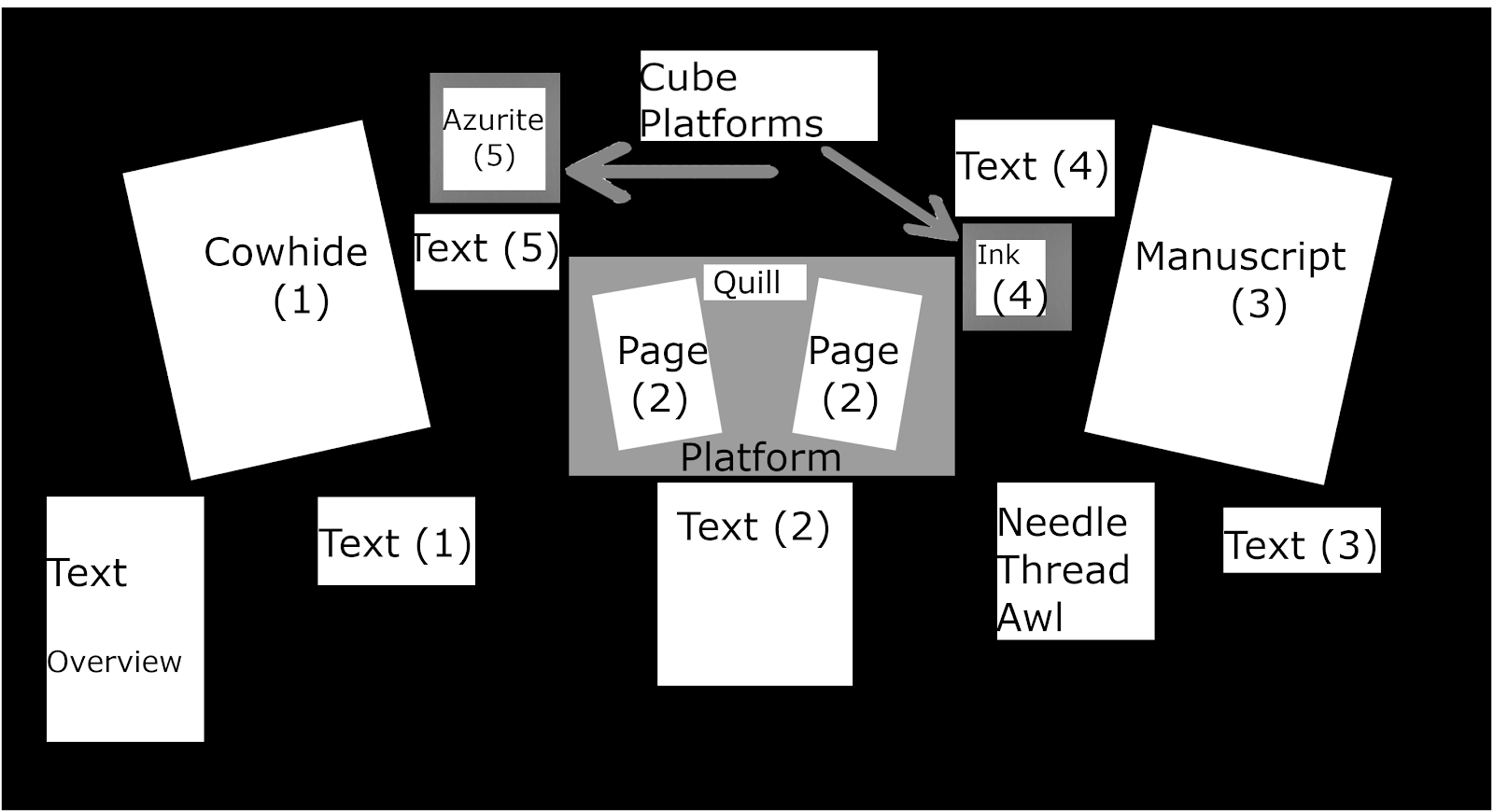
Some of the hardest (and most fun) work of the entire case design process is figuring out what the story should be and which objects tell it best. The objects we picked had to look interesting from afar, but also include details up close. They also needed to work together to tell a story. My team last fall decided that we wanted objects that would illustrate as many parts of the book making process as possible. Our story started with pricking and ruling the parchment for writing and ended with detailed initials and woodcut borders. This case was a way of showing how the pages of a medieval manuscript were created, but also how this process changed over time with the dawn of printing. We played around with a bunch of different display layout options and soon realized that, despite trying to make the case read from left to right, our eyes always went toward the center. Our final design included a main object in the center with the other objects from left to right.
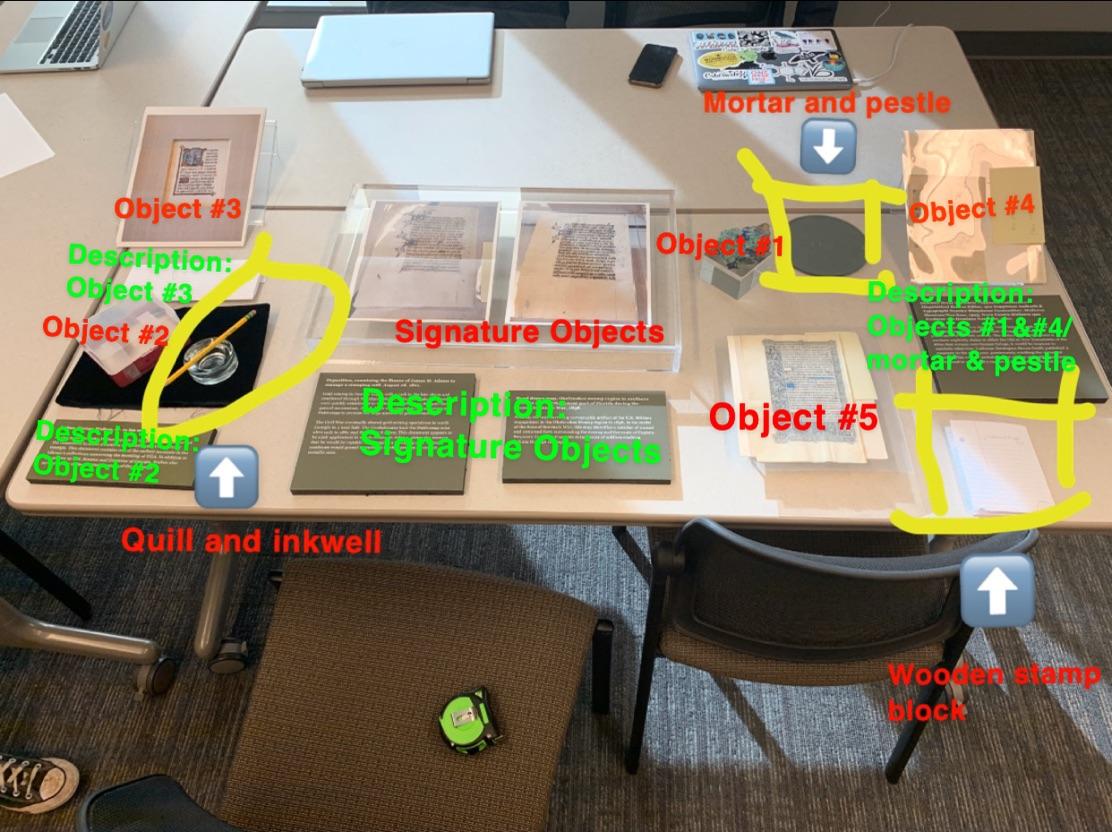
Despite being given the same guidelines, every team went in a unique direction. Another group focused on the production process as well, with specific emphasis on the tools that were used. They wanted their case to come across as if it were a scribal workshop, and it was really cool. They illustrated every step, from cow hide to bound codex. As seen in their case layout, they utilized several different platforms for displaying their scribal objects.This variation of height adds interest to the exhibit and draws the viewer in. The angles of the objects were something that I never really considered when thinking about visual storytelling, but slight changes in the positioning of the objects can change the entire feel of the case.
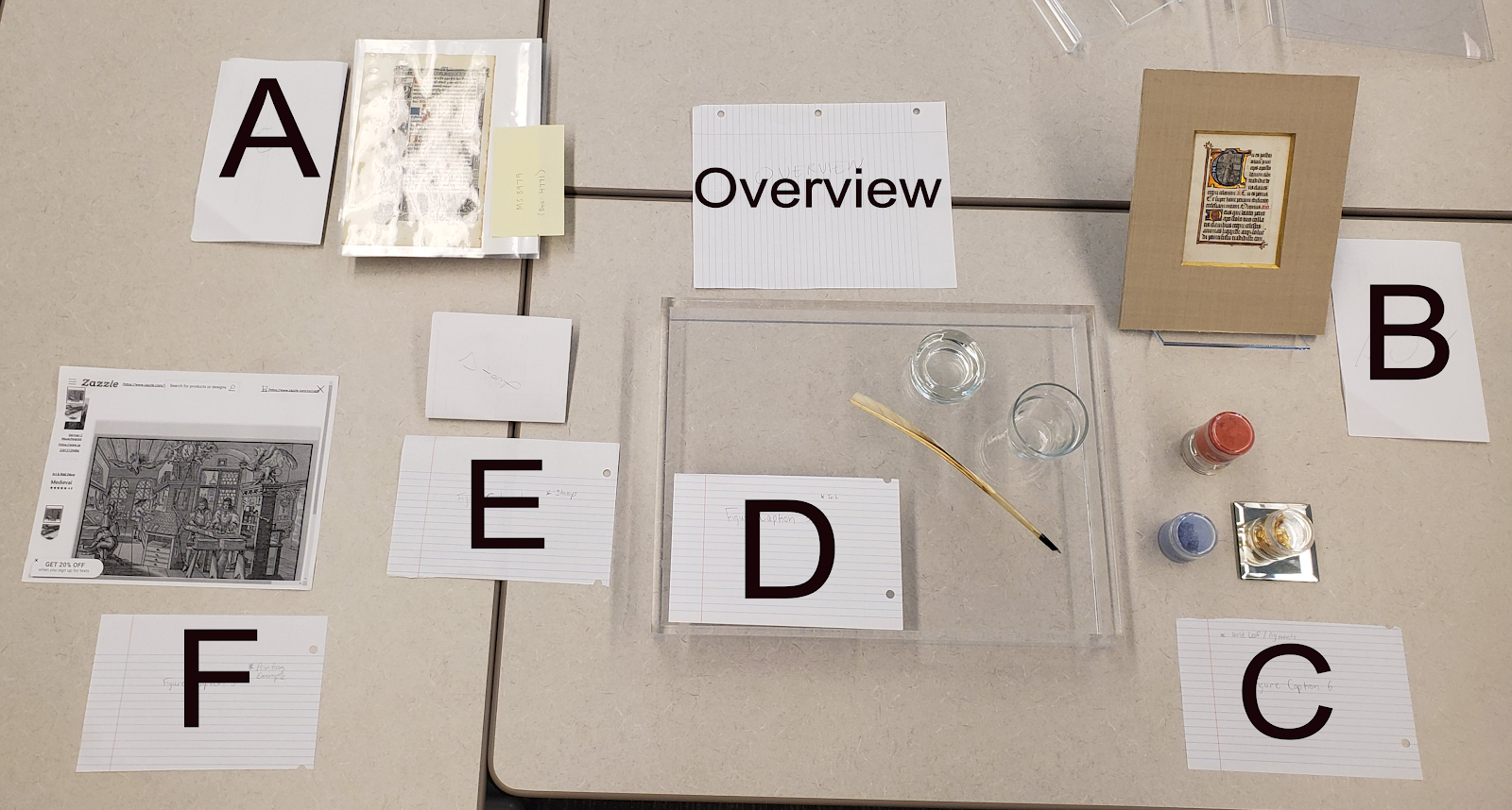
This was especially important for the next team, which wanted to utilize flat objects almost entirely. This team focused on the printing press and how manuscripts evolved into print books. They were interested in how books became more accessible and less time consuming to make. Their case included early printed leaves, as well as illustrations of a printing press workshop.
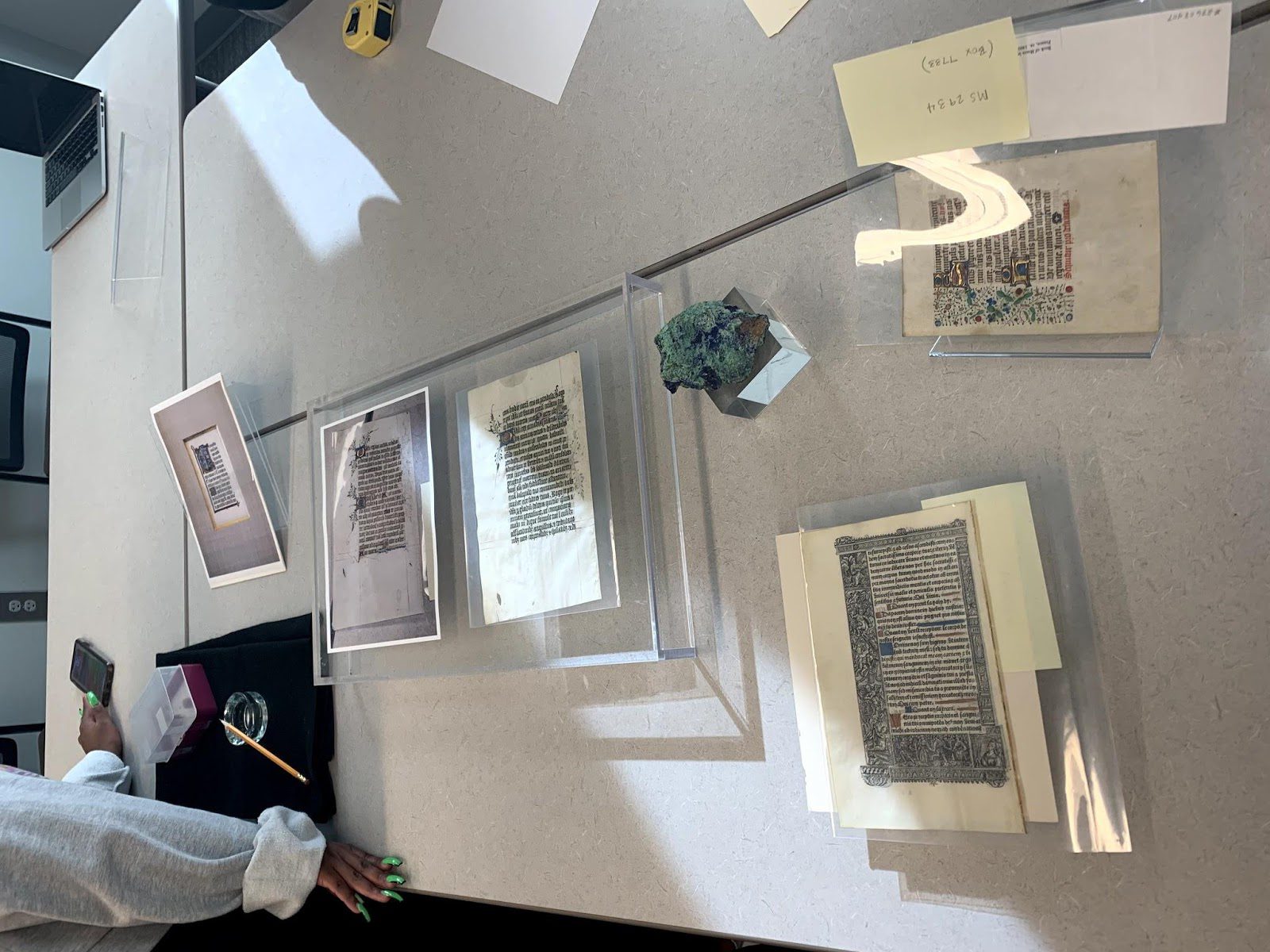
The final team’s case explored the various types of manuscripts that were being made in the Middle Ages. Many of the books that we study in class are liturgical, but medieval manuscripts could be about almost anything. This team’s case gives examples of manuscripts owned by UGA, including a poison manual, a bible leaf, and a sheet of music.
Through this case design exercise alone, I learned that there are so many new components that arise when telling a story through objects. Keeping objects visually interesting is important, but so is writing caption labels that are informative. The caption labels must be appealing and easy to understand for anyone who might come into the exhibit space. This is challenging because anyone from a professor to an elementary school student could come through the galleries. Other challenges included trying to pack as much as possible into a small number of words, trying to fit as many objects as possible into a single case, and of course keeping each of our stories in mind.
Each of these cases told a different story, and they all gave me ideas that can be incorporated into the final exhibit, which will be on display in Fall 2020. The Hargrett exhibit will be made up of four cases that correlate to the Hargrett Hours courses taught by Dr. Camp. The first will be taken from our work last semester and will showcase the various types of manuscripts that were made in the medieval period. The next case will feature pigment analysis data and information about medieval pigments and inks, which will tell the story of how manuscripts were decorated and the painstaking work they involved. The third will focus on our favorite type of medieval manuscript, the Book of Hours, and specifically on the Hargrett’s contents and focus on the Passion. This case will paint a picture of where the Hargrett Hours came from and give viewers an idea of the kind of information that can be learned from a single object. The final case will be pedagogical and provide information about the classes themselves and what they discovered. It will illustrate all of the time and effort that goes into this research, plus some of the fun stuff that we have done, too.
Overall, this is a very different kind of storytelling. It really pushes the boundaries of the ‘show don’t tell’ lecture every English major gets in their Intro to Creative Writing class, but it will certainly be worth it. I look forward to being able to display the huge amount of research that all of the Hargrett students have done. So much time and effort went into the research process and I feel truly honored to get to share that hard work in this public way. Without their dedication to this project, this exhibit would not be possible.