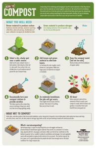
The infographic is intellectually stimulating in that along the top border, the piece describes the benefits that stem from composting, composing a compelling a composing argument that leaves almost no room for the viewer to disagree. In doing so, it convinces the audience that each and every person can contribute to the environment through the composting process. By using a simple step-by-step format with clear instructions, paired with modern and minimalistic designs, PBS Nature has creatively displayed the ease with which one can compost. The organic color scheme draws the viewer in without distracting from the vital information the infographic seeks to communicate. As far as a gut response, the graphics are pleasing and nothing aesthetically sticks out in a negative way. I was surprised by some the green and brown compostable materials, particularly lint, as I did not think such a material could hold any form of value in relation to composting. Overall, the infographic is quite pleasing, so they were no particularly strong, negative emotions I associated with the message. In all honesty, as we have been discussing composting so heavily in class, there is nothing that seems particularly groundbreaking. I believe the infographic’s purpose is to communicate the ease with which one can compost, and it is quite successful. There are no sources listed; however, the infographic is a direct product of PBS Nature, which is a trustworthy source on its own. It might’ve been nice if they had listed further sources for people to do more of their own research, but I don’t believe it is vital to the communication of the message. This infographic is obviously geared towards adults who live in their own houses with some form of a yard to keep an outside compost pile. University students do not have the same resources. There is a multitude of issues that the infographic doesn’t address when it comes to university living, but because the ad is not geared towards university students that is to be expected. Thus, in terms of creating our own infographics, we obviously need to take university restrictions into consideration while still communicating the information in a simple, understandable way.

