
Ku Kim
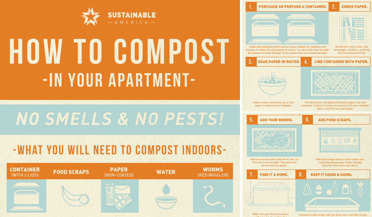
What: The infographic is very intellectually stimulating because it educates those with apartments on how to make a difference. It’s relevant to the audience (aka those who own apartments) because it appeals directly to them by saying “how to compost in your apartment.” It’s different and creative because I haven’t seen compost infographics or posts geared towards those who specifically live in apartments.
Gut: Initially I really liked the infographic and what it was portraying; however, now that I am analyzing it, it doesn’t educate as much as it could. It generalizes the categories of things you can add to compost, but food is too broad. There are many food scraps that can’t be added in.
So what?: I think the artist was trying to get millenials and those living in apartments to try and compost, even though their living situation isn’t most suitable for it. He or she oversimplified the concept of composting, making it look far too easy to do. They could’ve done more thorough research. Instead, they have not 100% accurate info.
Now what?: I certainly think that after analyzing some infographics, we need to make design and info of the utmost priority. We need to consider how we should appeal to students because why would they be interested in changing their habits if they truly don’t see the simplicity and benefits of it?