
The infographic I have chosen is intellectually stimulating, and gives interesting information and statistics to readers. I find the graphic relevant because it pertains to our future and the U.S. specifically, in terms that people would be familiar with. It is creative, also, in the design and presentation. The infographic is eye catching and colorful.
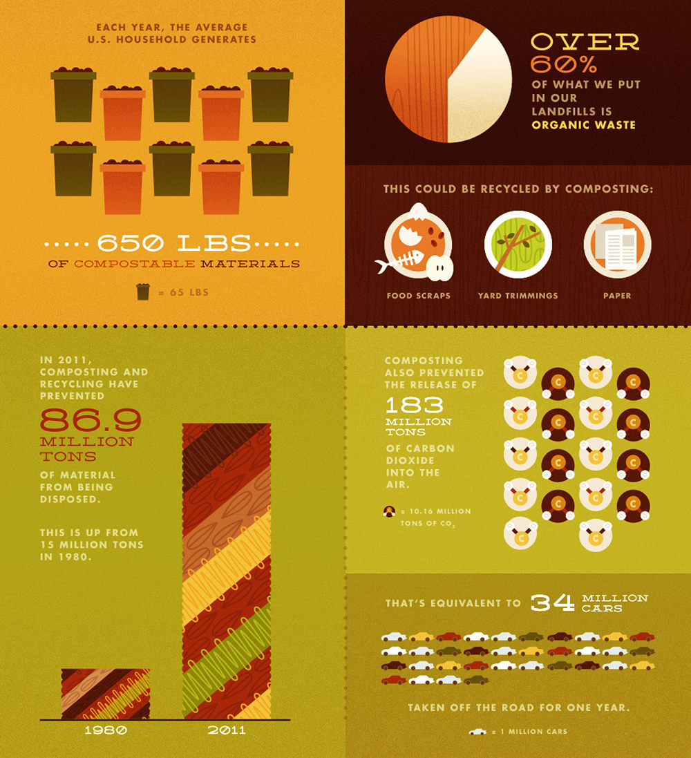
The graphic gave me hope right off the bat. It shows statistics on composting that I found to be positive, and gaining momentum. It shows that the population is taking a step in the right direction, and we just need to keep trying our best to be mindful and compost. I was pleased when I saw the picture.
I hadn’t thought of the past before. I was always focused on the present. Many infographics do little to give us hope for the future, but instead scare us about what will happen if we don’t improve. This infographic creator was trying to give us insight into how far we have come by composting, and makes it clear that we can achieve improvement, because it’s happening around us all the time. The infographic draws on past years statistics, and this infographic, along with many others, was published online for the media to use and magazines to print. We can trace the data back through past public records about trash and environment.
I think that perhaps the students haven’t considered the total overall impact that long term composting can make. They may know the basics about how it is good for the environment, but do they know about real results that we could be seeing in the future? Maybe they haven’t thought about it because we are so caught up in the present, and how to make our lives easiest. It’s an American way of culture to put yourself first, but maybe it’s time we did more for Mother Nature. I think we can instill hope in our graphic, much like this one does.