Delaney Williams – Infographic

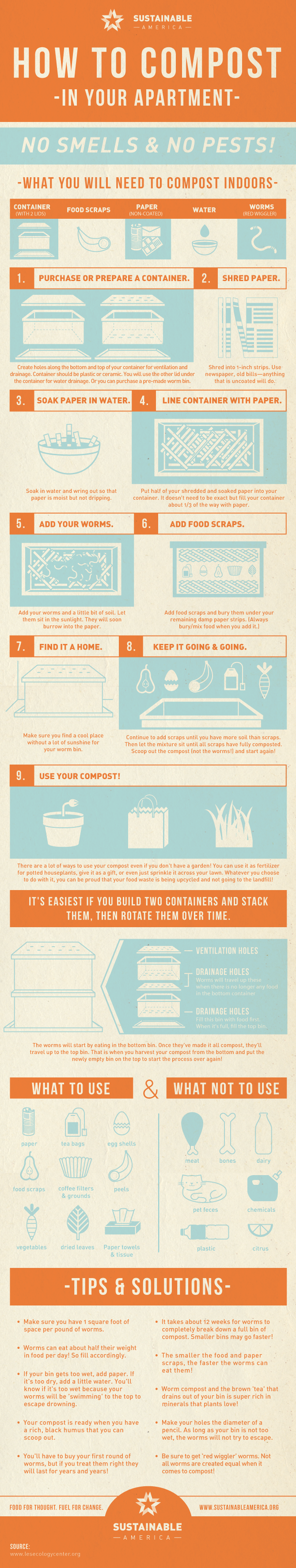
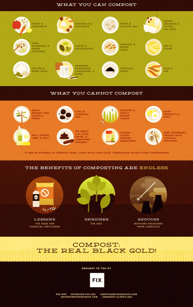
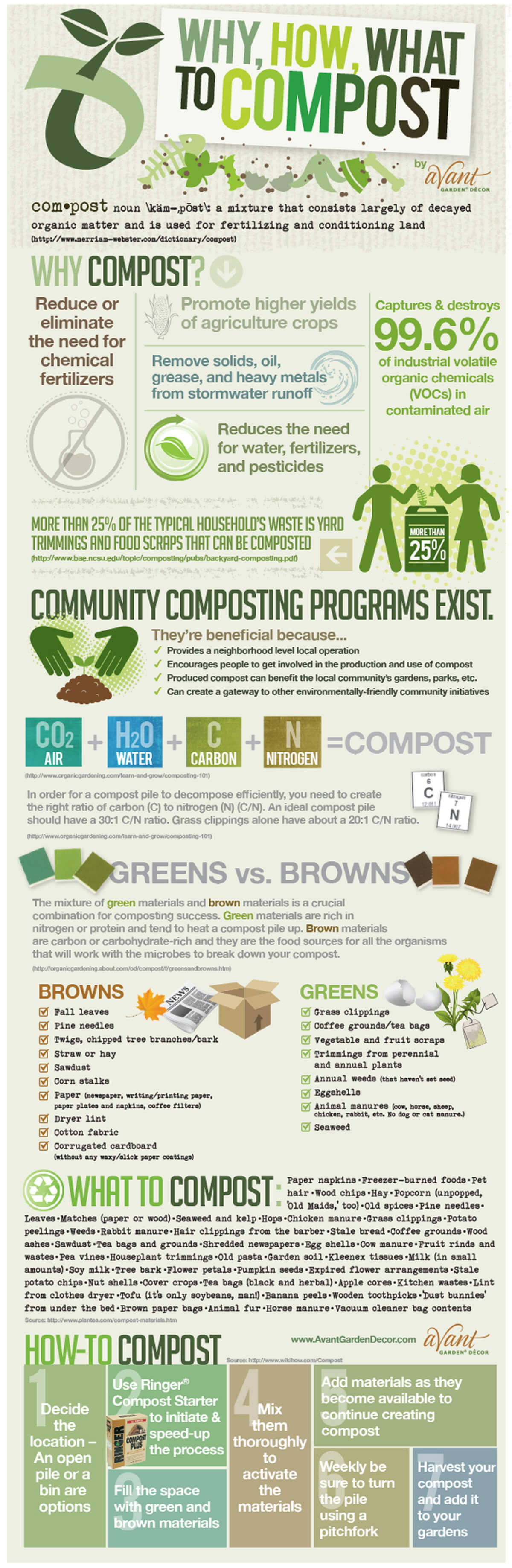
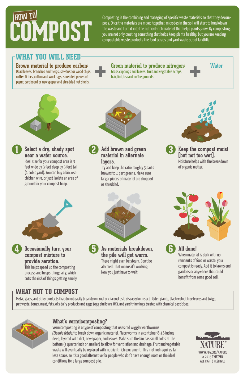
The infographic is intellectually stimulating in that along the top border, the piece describes the benefits that stem from composting, composing a compelling a composing argument that leaves almost no room for the viewer to disagree. In doing so, it convinces the audience that each and every person can contribute to the environment through the composting process. By using a simple step-by-step format with clear instructions, paired with modern and minimalistic designs, PBS Nature has creatively displayed the ease with which one can compost. The organic color scheme draws the viewer in without distracting from the vital information the infographic seeks to communicate. As far as a gut response, the graphics are pleasing and nothing aesthetically sticks out in a negative way. I was surprised by some the green and brown compostable materials, particularly lint, as I did not think such a material could hold any form of value in relation to composting. Overall, the infographic is quite pleasing, so they were no particularly strong, negative emotions I associated with the message. In all honesty, as we have been discussing composting so heavily in class, there is nothing that seems particularly groundbreaking. I believe the infographic’s purpose is to communicate the ease with which one can compost, and it is quite successful. There are no sources listed; however, the infographic is a direct product of PBS Nature, which is a trustworthy source on its own. It might’ve been nice if they had listed further sources for people to do more of their own research, but I don’t believe it is vital to the communication of the message. This infographic is obviously geared towards adults who live in their own houses with some form of a yard to keep an outside compost pile. University students do not have the same resources. There is a multitude of issues that the infographic doesn’t address when it comes to university living, but because the ad is not geared towards university students that is to be expected. Thus, in terms of creating our own infographics, we obviously need to take university restrictions into consideration while still communicating the information in a simple, understandable way.

Composting in Your Apartment

What:

  1. The infographic provides intellectually stimulating content through ingenious ways to compost with an urban lifestyle. Nowadays, with the rise of so many life-hack channels on youtube, the idea of easy ways to compost would surely appeal to a consumer.
  2. As composting, and waste management at large, is an issue in urban communities, said communities would find information that lightens the load of waste directly beneficial to their everyday, while potentially finding a sense of fulfillment in contributing toward lessening the impact of climate change and pollution.
  3. The infographic uses a consistent colour palette with icons for ease of understanding, making an easily digestible graphic. This is accompanied by many different ways of composting that are not commonly thought of.

Gut:

  1. I was interested to learn the ease of starting a vermicomposting system within the home, along with the various methods of composting materials that are traditionally discouraged in large-scale composting (paper that may fly around in compost piles, etc).

So what:

  1. The infographic is sourced by lesecologycenter.org, an organization based in New York that has been working on sustainability issues since 1987. Looking at organizations with history of sustainable use activities helps researcher draw on years of data and practice, just as farmers do with centuries of agricultural development.

Now what:

  1. The infographic does not consider the following
    1. The dislike of worms and dealing with them
    2. Potential smell of compost
    3. Laziness
  2. Clearly, the infographic is meant to target individuals who are readily invested in the sustainability of their actions, not those who are only mildly invested. As such, tactics need to target larger operations such as businesses, offices, apartment complexes, etc. This will make sure that there is communal accountability, leading to more investment and contribution in composting.

Infographic

For the 3 characteristics of effective informative delivery: The infographic is intellectually stimulating in the way it makes the reader decide what it is that they’re looking for in their composting solution. The flow chart style also makes it more personal and relevant to each person looking at it. The reader can get only the information that THEY need from it. This let’s each person focus on the essential parts to them. The infographic also shows creativity in it’s design. Not many infographics I found were flowcharts. It also uses simple language that’s fun and easy to follow.

Overall, I was very pleased with the entire infographic. It was so easy to read and the information it delivered was helpful. Composting can be an overwhelming concept especially getting started. This infographic takes out all the hard work of deciding how to get started and boils it down to just a few simple questions. The only thing that may have been even better is if somewhere near the bottom it had a description of what the different composting options were and how to do them. The colors, font, and drawings help make the infographic cute and unintimidating.

A lot of these concepts for composting I had not even considered or heard of. I really appreciated getting to see the variety of options out there. This widened my perspective to how there’s not really any excuse not to compost since it can be done in some form no matter the circumstances. There aren’t really any sources on the infographic and more seems to be the author’s thoughts on what would work best. I don’t know how helpful this would actually be for our class composting project. The university seems to already have in mind what way they want to compost, so I don’t think they’d need this infographic to help decide how they want to compost.


Infographic

This infographic accomplishes two goals simultaneously. Through its creative name and sectioned design, the infographic provides information both about why composting is important and how you can do it. The statistics provided on the left side of the page are interesting as well as intellectually stimulating because those numbers prompt reflective thought about our own habits and contributions to the issue of waste management. The right side is relevant to the audience because the target audience of this infographic likely does not know how to compost, so providing a brief how-to in the infographic is helpful and appropriate. For someone unfamiliar with composting, these statistics would definitely be jarring. Personally, having learned of the drastic consequences of not composting, this information did not surprise me. This creator is assuming a perspective of our ability to help on an individual level. The stick figures chatting and the use of the word “you” incorporate the audience as having a direct role in the process of composting or not composting. I think this infographic is particularly effective because it combines the information about composting as well as shows how you can do it, something I would not have thought to do. The sources of data are mainly statistics about what percent of what we throw out is compostable versus non-compostable, and this data along with other interesting statistics could be found online. For students, I feel it is important to consider the balance of information with the aesthetic of the infographic. Too much information makes it hard to read, but too many pictures or a complicated design subdues the infographic to a passing image on the wall. I think the pictures on this infographic are well-chosen, but some of them are very small or placed in locations where they are less emphatic or not noticed. Perhaps this thought is neglected in the creation of other infographics because the main point of an infographic is to inform. This infographic, to me, is a good inspiration because it doubles down on information about composting and is informative as well as instructive.

Infographic – Sarah Kate Brewer

CompostInfographic02

I chose this infographic because I think it is extremely educational in an eye-catching way! This infographic is designed in a creative way because it points out specific details about how compost is beneficial to the soil and watersheds by placing the facts in the different layers of soil. It is intellectually stimulating in the same way because as the audience reads each advantage to composting, they can see where the benefit might help specifically in the soil. For example, in the deeper layer of soil, the infographic tells us that composting can increase microbial activity. This would not happen at the surface of the soil, so the designer chose to place this fact where it was relevant – within the soil. This infographic is also relevant to the audience because not only are they learning what the benefits to composting are, they are learning more specifically where these chemical and physical changes are happening. The audience can know what to look for in their own garden with the information in this infographic!

My initial reaction to this infographic was that I was surprised. I like how this infographic ties together what we have been learning about all semester. We first began the semester by exploring the watersheds in Athens. Now that our next unit is about soil and composting, it is really fascinating to see how the two areas of biology go hand in hand! This was something I had not considered before. Though we have had many discussions in class about the two processes (watershed systems and composting systems), I kept them in separate categories in my head. I think the creator of this infographic was hoping to put the necessity for composting into perspective for his/her audience. Not only does composting increase the quality of the soil, but this effect can lead to sustainability with other aspects of the Earth, too! Because the soil is rich, it can hold more water and reduce stormwater runoff that pollutes our environments.

This infographic was made from the information provided by the Institute for Local Self-Reliance organization. As a class, it is important to use information that we not only find relevant, but accurate. We should be looking at credible materials that we can trust. For the infographics we make for UGA students, I believe we should look specifically at research that has been done about composting in Georgia specifically or in areas with a similar climate and quality of soil. Furthermore, I think this infographic leaves out one key aspect that we should include in our class infographics that we create. This infographic does not include a guide on how to get started with composting. It also does not give any information on the best way to compost or where to find this information should you want to start composting in your garden. I believe educating students about how to compost safely and effectively should be one of our main focuses when creating infographics. I look forward to what we will make together as a class! – Sarah Kate

Infographic- Why Should We Compost?

  • WHAT: This infographic is intellectually stimulating in the way that it presents the benefits of composting. For me, the information about how composted soil retains water better made me think about how we could use compost to aid agricultural regions- such as California- that are experiencing drought. I had not thought about benefits of composting past adding fertile nutrition to soil and reduction of waste so this new benefit was intriguing and stimulating. It took the facts and spun it in a creative way that was relatable to its audience. It put the amount of waste created by American cities in terms of the weight of the Statue of Liberty. This effectively makes the audience think “oh WOW really?” and become more open to what the infographic is saying.
  • GUT: I was surprised by many of the facts about household waste in America. We are truly ruining the environment at a horrifyingly quick pace.
  • SO WHAT: I had never thought about how composting might make the soil able to retain water better and how less watering accompanied with lower fertilization costs could reduce agricultural costs. This would give motivation for farmers to actively compost. The author of the infographic was definitely trying to inspire people to compost by showing them the amount of waste Americans create and how this waste could create positive effects if composted.
  • NOW WHAT: I think our infographic should also include shocking facts put in a relatable way (i.e. no percents that can often be conceptual to the average person. Instead, it should take the data and put it in terms of something people can easily call to mind.) However, this infographic does not properly show the negative effects that result from food rotting in landfills. This information is vital to understanding why composting is necessary rather than just something that would be nice if it happened. Our infographic should show how much waste Americans create, how terrible rotting food waste is for the environment, and then show composting as a necessary step in order to slow down the rate of global warming.

Allaina Siler Composting Infographic


Regarding the three characteristics of effective informative delivery, the infographic is intellectually stimulating because it makes you think about what you can and cannot compost. It causes the viewer to contemplate what materials they have on the infographic at home, and whether or not they belong. As for being relevant to the audience, it would be perfect for the Rooker Hall demographic because the information is specifically tailored for people on campus in a dorm. And, I think it’s creative with its use of the neutral, mellow color scheme, as well as the cute illustrated items that either can or can’t be composted. Also, the three fonts work well together from a design standpoint and would be perfect and easy to read.

As for my gut emotional responses, I was immediately content because it is just so well illustrated and I love the mellow green background with the illustrations of food and other materials. It surprised me that newspaper is compostable because I thought the inks would have chemicals that might be harmful, but I guess not. Nothing angered or frustrated me because this infographic was carefully and thoughtfully made. And, the information didn’t deal with something upsetting like the news.

Before this infographic and this unit, although I barely knew anything about composting, I didn’t think that people would attempt to put plastic materials or processed food into compost piles. I suppose it makes sense with the plastic materials if the theoretical person confused recycling and composting, but I would never think to compost pizza just because I before assumed only fruits and vegetables could be composted. From the infographic, the creator was probably just hoping that the people on campus would gain a new perspective on what they could or couldn’t compost. To find this data, they used one source which is a Toronto informative website with information about what can and cannot be composted. We might engage in finding this data by just copying and pasting the information into a search bar, since they provided the source on the poster.

Although this compost infographic is very successful from a design and informative standpoint, I think maybe they could’ve considered a bit on why the demographic can’t compost certain things. However, it makes sense that they haven’t thought of including this in case there would be too much information that the viewer would not want to read and possibly walk away from the sight of too many words. We can definitely use this as an inspiration for our graphic with the layout of the work because the information is so clearly displayed. Not to mention, we can kind of copy the illustrations (still changing some aspects) for the images of the things that can and can’t be composted.

Bio Infographic

What: This is infographic is intellectually stimulating almost the entire way through. To begin with it starts out by pointing out the agricultural and biological advantages of composting along with some helpful statistics. It goes on to display the chemical composition of compost and discusses the chemistry behind the necessary factor of creating the right ratio of carbon to nitrogen in order to create the ideal conditions for compost. The infographic also establishes its relevancy to the audience by addressing common households personally by including them in the statistics. It also addresses the audience when it discusses the convenience of community composting programs and their benefits and when it explains a step-by-step how-to compost for beginners. Through this, the infographic is targeting the average family household. The infographic is both creative in its design and information. The small pictures and overall structure of the pamphlet makes it an interesting read that is easy to follow. In order to make the information creative, the author includes some interesting statistics and not only explains what compost is but also tells the reader exactly what they can do to be a part of this green movement.


Gut: I was very pleased with the infographic as a whole. The creator did an excellent job of hitting on all the major aspects that someone new to composting would inquire about. In doing so, the creator has made it more likely that the person reading this will feel both confident and motivated to take the next step in composting themselves. The structure of the infographic flowed very nicely all the way from why should we compost to how to compost yourself. It’s good that the reader can just about get all of the necessary information that they need just from this infographic alone.


So What: The part of this infographic that I had not thought about before was the segment in which the creator addresses the existence of community composting programs. This is extremely helpful for someone who is new to the process altogether. The idea that composting could be a community process rather than an individual one will make people more likely to participate. The individual will usually follow the herd. I believe that the creator wanted the reader to understand that composting itself isn’t a tough habit to start. The how-to is simple and short and can makes the task seem a little less daunting and laborious. He also seeks to display how beneficial composting is not only to farmers but society as a whole.


Now What: Although this infographic is extremely well made, I feel that we would need something a little more shocking in order to convince young adults. Since the earth’s well-being is the last thing on a college student’s mind, we would need to include facts or statistics that would be sure to grab their attention. Students would only be pushed to really care if they were aware that these composting and its benefits have a major effect on their lives in some startling way. Including some information on how composting can actually save you money in some way would also be helpful, because college students will do anything to save a buck.

Infographic – Saloni Gupta

I was not able to get a clear copy of the infographic, so please go to https://ilsr.org/compost-impacts/ to get a better reading.

What: This infographic is intellectually stimulating. After a brief explanation of what composting is and consists of, the reader is immediately taken to a simple yet powerful picture of a garbage bag with one side looking gray and the other side with contents of what most people would actually throw into the bag. This is a compelling image because it also attaches percentages to what can be composted in regards to what gets thrown into a trash bag, coming to a conclusion that more than 50% of what is thrown in a trash bag can most likely be composted instead. This picture makes the idea of composting more relevant to the audience because it literally depicts that composting does not require out-of-the-way materials, but instead materials which are getting thrown away on a regular basis. This infographic is also creative in that it does not only describe how composting can obviously help the environment, but it also appeals to those who may not be so interested in the environment by incorporating how composting can help the economy by creating jobs. This way, the infographic serves the purpose as being informative and attractive to all kinds of people.

Gut: I was quite pleased with this infographic. I felt like this was a well-rounded graphic which organized the material in an easy-to-follow way. While most people know that composting is beneficial to the environment, I really liked how this infographic dived into the specifics of how composting can legitimately improve the environment. It explains the benefits to the soil by literally going through the different levels of the soil and inserting the positives. The graphic also states the harms of food scraps to the climate and then immediately turns the mood around when depicting what happens to the climate if food scraps are converted into compost. This infographic really succeeds in the job of not just telling but also showing.

So What: While I knew that composting is beneficial to the environment, also as mentioned in the infographic, the graphic also includes information on how it can directly impact a person’s professional life. The infographic displays information on how composting can create jobs. This is a factor of composting I had not considered before, but it is definitely an important one.  By including this bit of information, I feel like the creator was trying to depict to the audience the importance of composting outside of the environment. This allows for the infographic and the concept of composting to appeal to people who may not be so environmentally mindful. After following through the sources listed, it seems as though the statistics in regards to the number of increased jobs is coming from their own website, Institute for Local Self-Reliance and press-release. As far as how we might be able to find this information also can be through specific searches on the internet, as the creator of this infographic did when wanting to describe the increase in jobs through composting.

Now What: Even though this is a great infographic, I wished it had expanded more on what people can do to compost. The last bit suggests on policies people can consider, however it does not mention legitimately how people can compost. A reason why they may have left this out might be because they were trying to appeal to people working at the local and state levels who can implement policies to encourage composting. We can use this as inspiration for the graphic that we create by making sure that while we still include the benefits to composting, we should also include how composting can be achieved for a common being without it becoming too complicated.