Composting Infographic – Harina Somasundaram

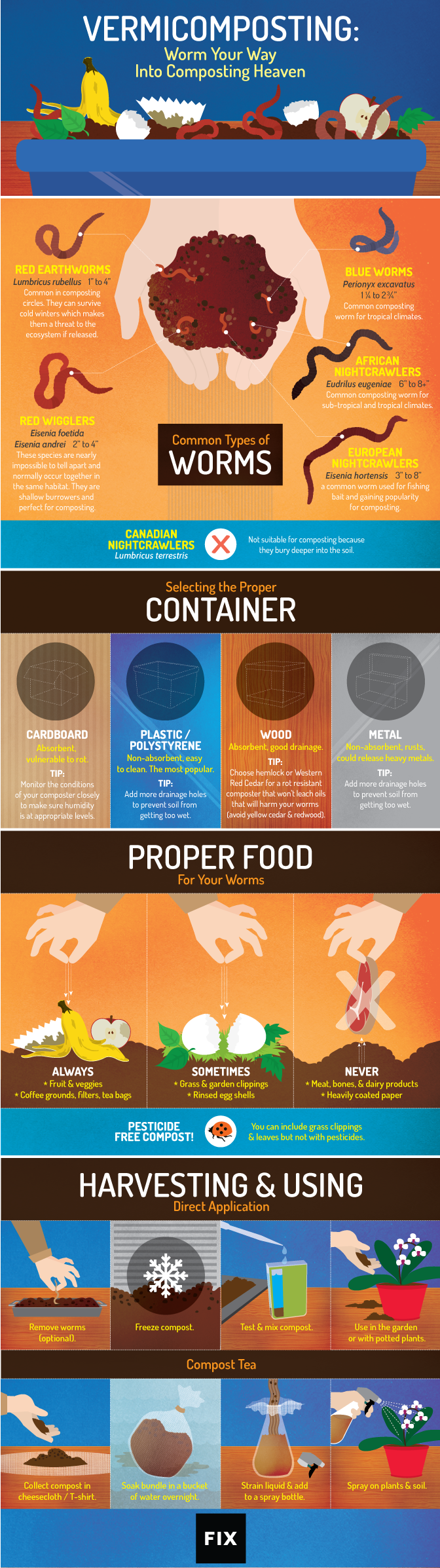
What: This infographic is simple yet appealing and showcases all 3 effective forms of delivery. It is intellectually stimulating because it offers the information in a step by step process with pictures allowing the reader to easily comprehend and take action. It also shows relevancy to the audience by mentioning how compost can help their personal garden in step 6. Lastly, it is creative because at a glance the audience can understand the purpose and what to do but at the same time information is not compromised — everything from how to compost, do’s and don’ts of what should be put in compost, and different types of composting is included.

Gut: The graphic invoked a feeling of practicality allowing taking action to be easy. By showing step to step procedure with few words and pictures, it showcased that composting is not much extra work and is purposeful. The picture in step 6 showcased the usefulness in a glance, making people want to compost. It was pleasing to read, because of the way the infographic was set up – easy terms and not cluttered with words — extra stuff put on the bottom and important things boxed.

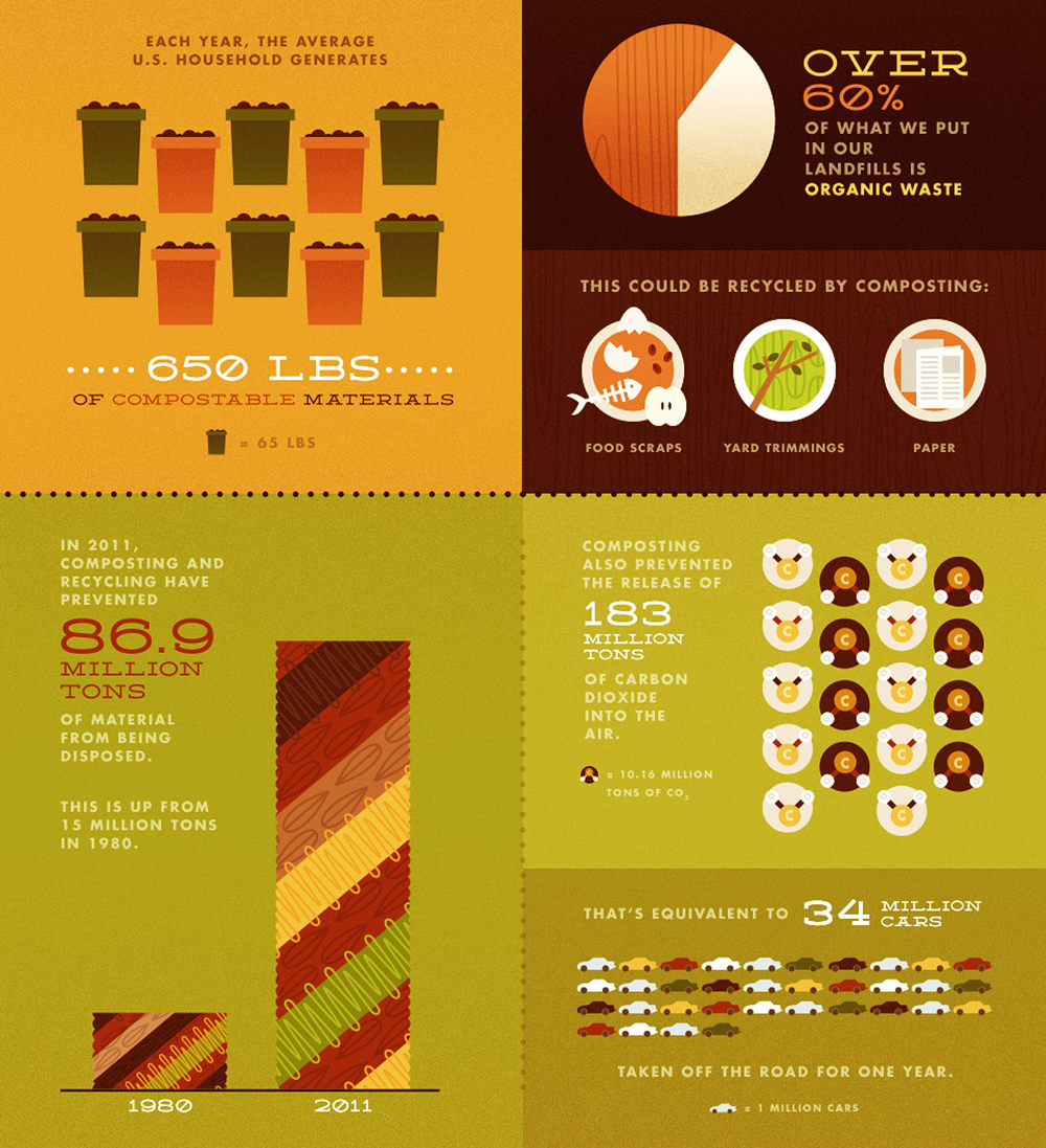
So What: Surprisingly, I had never thought that making compost was so easy and never realized the fruitful results it has – such as being able use it as fertilizer in my own garden. I thought it was too much work and never really saw the short-term benefit. This also seems like a financially and environmentally a good option due to being able to save money on fertilizers and recycling organic material. The source is pbs.com/nature. With this source, during class time we could go to this website and find more information on soil/composting and maybe even be able to elaborate on this infographic.

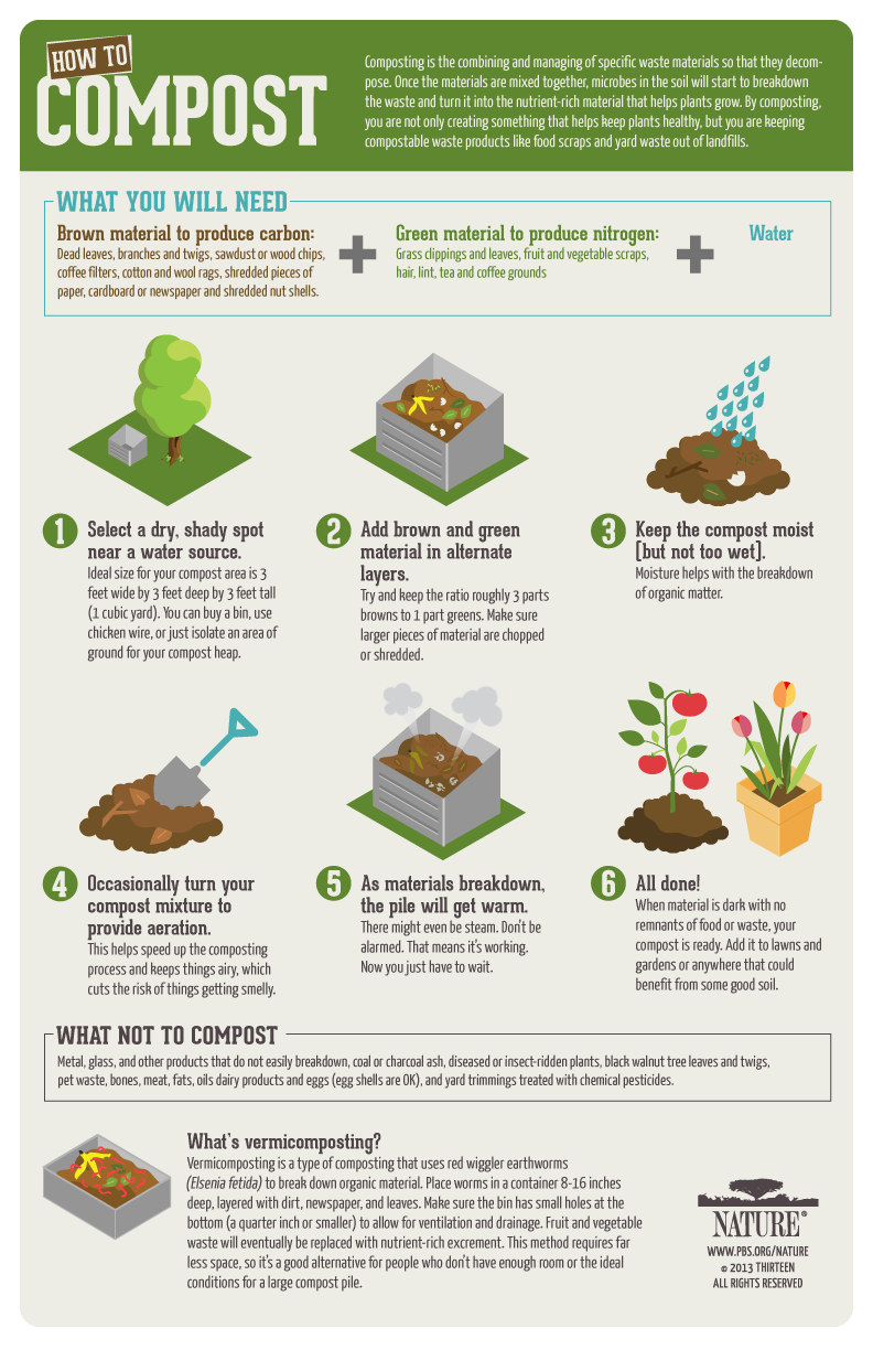
Now What: I think that making the steps of how to compost and what to compost is very important when talking to college students living in Rooker Hall/ECV community because they do not have the time to do research and if it is too complicated — students will not take part in the activity. Students have a lot going on in their day to day so we need to highlight purposeful and relevant information to them when giving them tasks. These things have not really come to light because we are all focusing on the research of composting that we are not looking at the delivery and outcome aspect.

.

Composting Infographic- Idan Kirshenbaum

This infographic is intellectually stimulating and extremely informational. It provides information about vermiculture, a process similar to composting, but it uses worms in addition to microbes and bacteria to turn organic waste into a nutrient-rich fertilizer. This graphic includes information about which types of worms to use, proper containing methods, what to feed the worms, and how to use the vermicompost. All the information in this graphic is relevant to vermiculture and presents the information in an organized, creative way for the reader to understand easily. The structure of the material and the simplicity of the vermiculture process described in this graphic surprised me and helped make this graphic very comprehensible. I hadn’t ever thought about how easy it would be to compost in my own home as the process is so simple and is described so well in this infographic. I believe it is essential that us as students help spread the word and teach other on campus that it is almost effortless to compost.

Infographic blog post – Julianna Mallette

The infographic I have chosen is intellectually stimulating, and gives interesting information and statistics to readers. I find the graphic relevant because it pertains to our future and the U.S. specifically, in terms that people would be familiar with. It is creative, also, in the design and presentation. The infographic is eye catching and colorful.

The graphic gave me hope right off the bat. It shows statistics on composting that I found to be positive, and gaining momentum. It shows that the population is taking a step in the right direction, and we just need to keep trying our best to be mindful and compost. I was pleased when I saw the picture.

I hadn’t thought of the past before. I was always focused on the present. Many infographics do little to give us hope for the future, but instead scare us about what will happen if we don’t improve. This infographic creator was trying to give us insight into how far we have come by composting, and makes it clear that we can achieve improvement, because it’s happening around us all the time. The infographic draws on past years statistics, and this infographic, along with many others, was published online for the media to use and magazines to print. We can trace the data back through past public records about trash and environment.

I think that perhaps the students haven’t considered the total overall impact that long term composting can make. They may know the basics about how it is good for the environment, but do they know about real results that we could be seeing in the future? Maybe they haven’t thought about it because we are so caught up in the present, and how to make our lives easiest. It’s an American way of culture to put yourself first, but maybe it’s time we did more for Mother Nature. I think we can instill hope in our graphic, much like this one does.

Infographic Blog Post – Greg Gruschow

This infographic is informative on what to put into compost, the moisture and shade levels of good compost, and how to properly maintain compost. Good compost should be mostly brown and green, as well as slightly moist. Occasionally turning the compost pile can also help. This infographic surprises me, because I originally had no idea how many factors needed to be taken into account when making compost. I thought the materials that went into the compost pile were the only thing that mattered, but this infographic taught me how moisture and shade also play a major role. I believe it is important for our local students to learn that there is more to composting than just piling up scraps.

Composting Infographic

What: This infographic is so appealing to me because it falls in line with all three effective forms of delivery. It is intellectually stimulating because it offers the information in a way that is easy to read yet teaches composting terminology at the same time. It also shows relevancy to the audience by mentioning the cost benefits of composting and how it can help all of our wallets while saving the earth. Lastly, it is creative through its illustrations and ways of construing ideas to the reader.

Gut: The graphic invoked a feeling of accomplishment before I even started composting. By showing all of the positive results that composting accomplishes, it created a sense of pride that I could save the earth by following a few simple rules. It was pleasing to read, because the terminology wasn’t super confusing, almost as if the intended audience was for a child without being condescending.

So What: Surprisingly, I had never even thought about putting the compost to use in my own dwelling–I always expected to send it off for someone else to use. So saving money on fertilizers by using fresh compost seems beneficial and a no-brainer. Sadly, the infographic fails to cite its sources, so I am curious to see where they got their information.

Now What: I think that highlighting the cost benefits of composting will be a biggie when it comes to attracting college students living in University Village. While composting may be environmentally friendly, in the end students will be more concerned about themselves and how to make it day to day. By highlighting information relevant to them, it may be easier to get them involved. I think the reason we haven’t thought of this yet is because we’ve been so driven on giving the how-to’s of composting, rather than the long term results that come with composting itself.